Those who know me know that I’m particularly fond of art. So, the release of a LEGO set that combines brick building with fine art naturally caught my attention. When the BrickNerd team suggested creating an article based on set 31215 Vincent van Gogh – Sunflowers, I was immediately on board.
I won’t go into the interpretation of Van Gogh’s original painting—plenty of great resources do that already, and I encourage you to explore them. They offer a deeper understanding of the artist’s approach and how he saw the world.
LEGO also created a great introductory video, which I’ve included here:
I was lucky enough to see some of Van Gogh’s paintings in person at the Musée d'Orsay in Paris. One in particular, Les Chaumes de Cordeville (painted just a month before his death), left a strong impression. The vivid contrasts and the precision in his brushwork were stunning up close. The painter’s detail work seen up close was extraordinary.
After building the set as instructed, I was curious to explore what else could be made from the included parts. My initial idea was to build something artistic, but entirely different—perhaps a bright light yellow house with a thatched pearl gold roof? But without SNOT (Studs Not On Top) elements, which the set lacks entirely, I couldn’t make it work without taking a trip to my own drawers. That felt like straying from the challenge, so I shelved the concept.
Then I thought, why not follow Van Gogh’s lead and make my own version of Sunflowers? He created an entire series of them, after all. But to do that intuitively using only the parts in the box required more planning than improvisation. It was time to study the set’s inventory.
Color Breakdown
Right away, I noticed the set is full of thin elements—mostly plates and tiles—which makes it trickier to build something with depth like the Starry Night (21333).
The aim of my analysis was not to identify the new parts or colors contained in the box (our friends at New Elementary do that much better) but rather to obtain an estimate of the distribution of part colors in order to sketch out something based on this distribution.
So, using BrickLink’s inventory as a starting point, I made some clever calculations by adding up the number of pieces of each color. It’s not totally representative of the possible surface area (since a 1x4 plate covers eight times more surface area than a 1x1 plate, for example), the chart is a general summary of the amount of each color I had to work with.
It soon became apparent that three colors dominated the set: Bright Light Yellow, Pearl Gold, and Yellow. Together, they made up more than half the total piece count.
Framing the Canvas
I decided to stick with the same basic structure as the original set (frame and canvas) while modifying the content. I started by constructing the frame and the canvas background, leaving them blank.
I could therefore update my analysis by taking out the colors for the frame and canvas.
For those that are curious, here are the breakdowns of the quantity of each color in just the frame and canvas, primarily consisting of Tan, Reddish Brown, Dark Tan and White.
Some colors are also used in the painting, but are masked, such as Reddish Brown, Black or Red, which I show in this view taken from the instructions, using these green arrows.
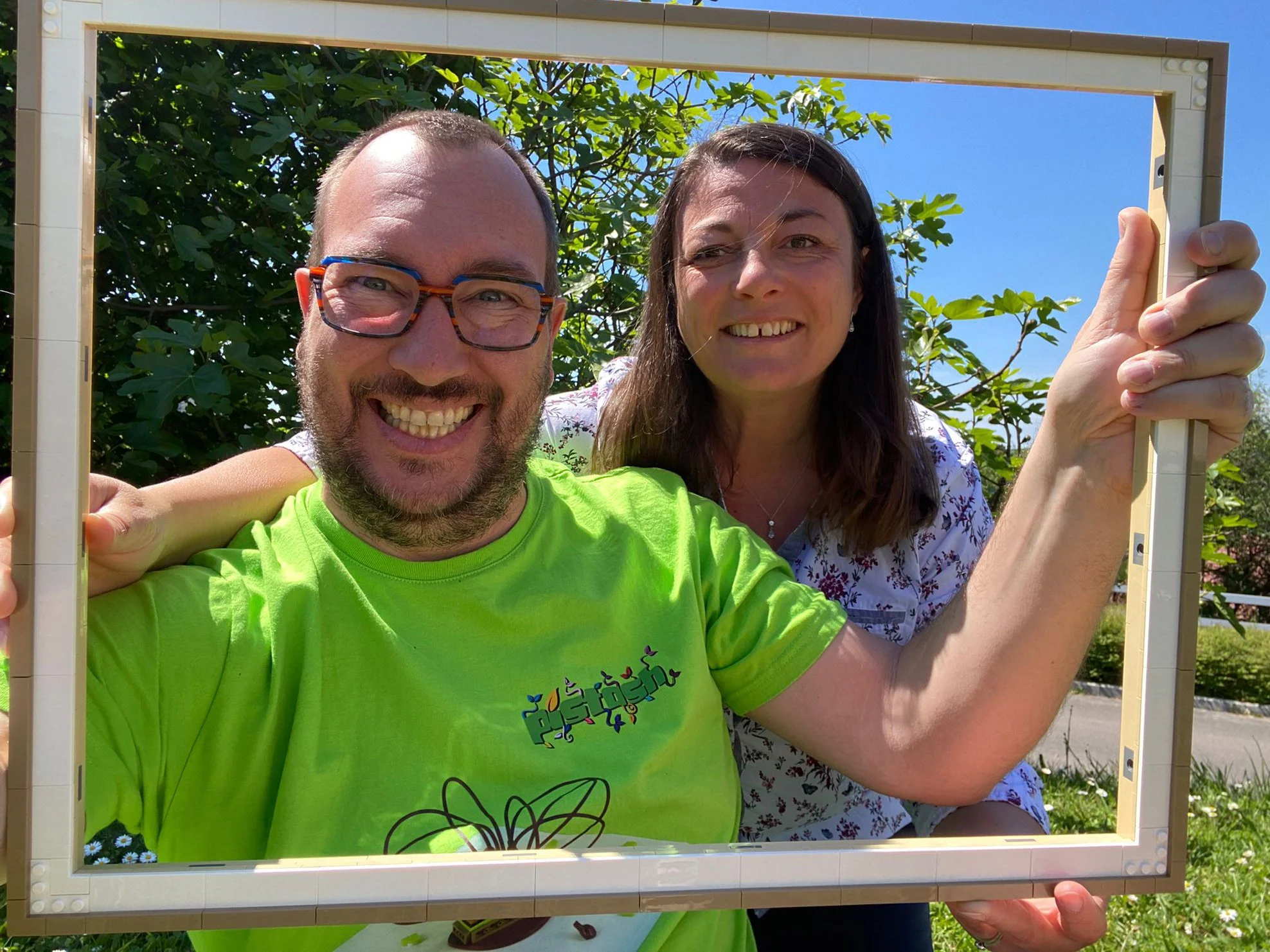
The frame can stand on its own. You can have so much fun with it by taking a few playful photos. I want to experiment with this more at birthday parties, but I have to admit, it was fun to have a frame made of bricks…
View fullsize
Re-Evaluating the Palette, Sans Frame
OK, back to business. What parts are left after we take out the frame? Let’s go back to our breakdown and see what inspires us..
With the frame and backing set aside, I re-evaluated the remaining parts. The three dominant colors—Bright Light Yellow, Pearl Gold, and Yellow—now made up 73% of the leftover inventory. These would need to play major roles in the build so we have no choice but to take them into account for the rest of the task.
I also grouped secondary colors into broader families like greens and browns to simplify planning.
A Wormy Apple Basket
Now it was time to create something new. To get started, I sketched a rough layout for the build, assigning areas based on the percentages of colors available in the set. With Bright Light Yellow, Yellow, and Pearl Gold making up the majority of the remaining inventory, they had to take center stage.
Bright Light Yellow, being the most abundant color, would serve as the general background. Yellow would become a large sun. And Pearl Gold would be perfect for constructing a basket, thanks to the large number of parts, especially elements 78256 and 61409, which appear 112 and 141 times, respectively.
From there, I wanted to include a green apple falling into the basket, with a tiny red worm emerging from its side. The red pieces in the set were limited, but just enough for a little detail like this. To make the scene more dynamic, I imagined the apple falling from a tree branch reaching in from the left. Ideally, this branch would have some depth and thickness to contrast with the flat background. I wasn’t sure how I’d achieve that yet, but I made a note to try stacking leftover pieces underneath the limited number of green elements.
Here’s the sketch I used to guide the build:
In the image above, I calculated the percentage of visual space for each color to make sure I had enough to achieve my vision. With that sorted out, it was time to get building and I moved to filling in some strategic areas first.
I started by outlining the largest shapes, blocking in the sun, the tree branch, and the basket. Rather than filling each section in right away, I marked out the contours and main lines of the composition. That let me keep a bird’s-eye view of the entire build and adjust areas as needed before committing to each zone.
The sun was first. I used the yellow pieces to build up a large circular shape. It was tight, but I had just enough parts to complete the sun and even saved a few curved horn pieces to use as rays of sunshine, adding movement and a little flair.
Next came the basket in Pearl Gold. I filled in the lower part of the canvas with a rounded shape and added depth by layering the pieces more heavily at the bottom. The basket came together smoothly thanks to the generous part count in this color, and I enjoyed the textures from the “cheese grater” elements.
Then I tackled the apple, using green elements to create a simple circular shape that looked like it was mid-fall. I added a red worm emerging from its side—just a tiny detail made from the few red pieces available, but one that added a bit of whimsy.
Building a Tree Out of What’s Left
The tree branch was the most challenging part of the build. I wanted it to appear thick and dimensional, but I didn’t have many green parts left—certainly not enough to fully build it out. So I had to get creative. I stacked various leftover parts—browns, tans, even hidden reds—to bulk up the structure, then covered the visible areas with the remaining green tiles and plates.
The result was a branch that extended from the left. It added visual weight to that side of the build and helped balance the bright sun on the opposite side.
So here’s the final result of this reworked painting.
Below are a few detailed photos.
I had a few parts left over, but not many. With a little effort, I probably could have found a place for them. Still, I was pleased with how thoroughly I’d used the available inventory.
Remaining parts
The Final Picture
After everything was in place, I stepped back to assess the scene. The composition worked: a sun glowing above, a basket grounded below, an apple falling from a tree branch, and a tiny worm offering a playful twist.
This project wasn’t as easy as I first expected. It required careful planning, especially when working with such a restricted palette. I had to constantly balance form and color, making sure I didn’t run out of key elements before finishing major sections like the background or branch.
That said, I’m aware that my painting is far from being an artistic piece worthy of the great Van Gogh, but I like it. This was an experiment in color, after all! I’m now counting on you to interpret my artwork’s deeper meaning The worm, the apple, the basket, the oversized sun... perhaps it’s about temptation, or imbalance, or even optimism. I’ll leave that up to you.
LEGO Art 31215 Vincent van Gogh – Sunflowers is available for around US $200 | EU €200 | CA $260 | UK £170 | AU $300.
DISCLAIMER: This set was provided to BrickNerd by LEGO. Any opinions expressed in this article are those of the author.
Have you ever abandoned the instructions and built your own creation out of a set? Leave your thoughts in the comments below.
Do you want to help BrickNerd continue publishing articles like this one? Become a top patron like Charlie Stephens, Marc & Liz Puleo, Paige Mueller, Rob Klingberg from Brickstuff, John & Joshua Hanlon from Beyond the Brick, Megan Lum, Andy Price, John A., Lukas Kurth from StoneWars, and Wayne Tyler to show your support, get early access, exclusive swag and more.