Hacking Studio: How To Get Better Lighting in BrickLink Studio Renders
Today’s guest article comes from BrickNerd patron Wayne Tyler. We’ve featured Wayne’s work numerous times and always marvel at his realistic renders. Today he shares some of the secrets behind getting the perfect lighting.
So you’ve finished building a digital model or scene in BrickLink Studio and now you want to render an image to send to friends or post on social media. You click on the render icon to bring up the render dialog, then click on the render button and then wait until sometime later when your computer is heating up enough to fry an egg when you finally get an image.
But what if you wanted to make that image look better, have more impact, and appear more lifelike? What should you do? The quickest and easiest adjustments to get an improved render are made with lighting.
Using What You’ve Got: How BrickLink Lights a Model
You can imagine the lighting environment in Studio as a large sphere that encloses all the objects in your scene. We can’t look at that sphere directly, but we can use a chrome LEGO sphere as a mirror to reflect the lighting environment. The reflections will help us understand where lights are placed, how much light they cast, and what color they are.
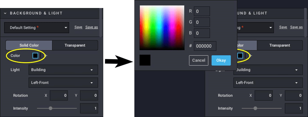
We’ll start with a solid color background. When Solid Color is selected, there is a small box below the label that shows you the color of the background. Clicking in the color box brings up a color picker where you can select a color for the background.
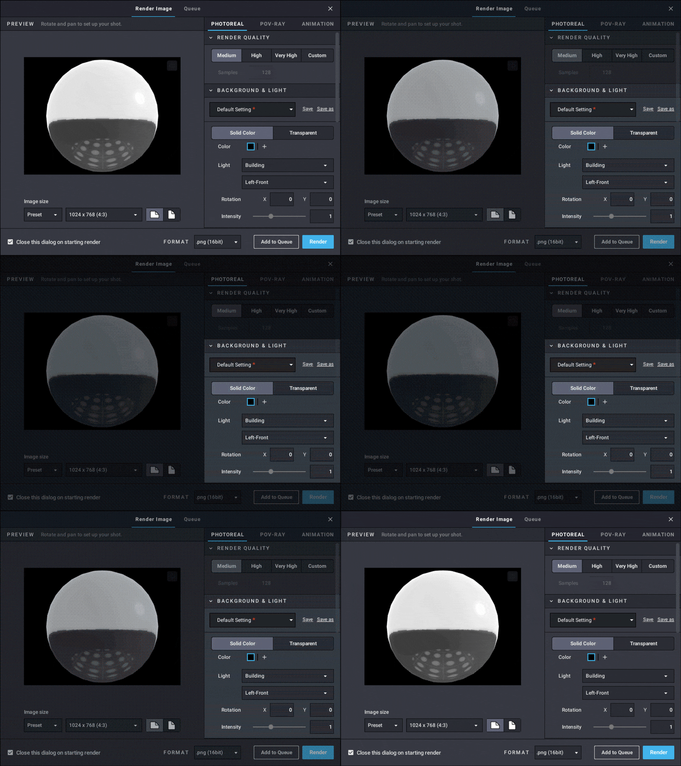
Be aware, the background color will affect the color of LEGO parts in your scene. You can see the differences in color in the below renders with different materials and background colors.

left – White, middle – Rubber, White, right – Chrome Silver rendered with red and dark gray backgrounds.
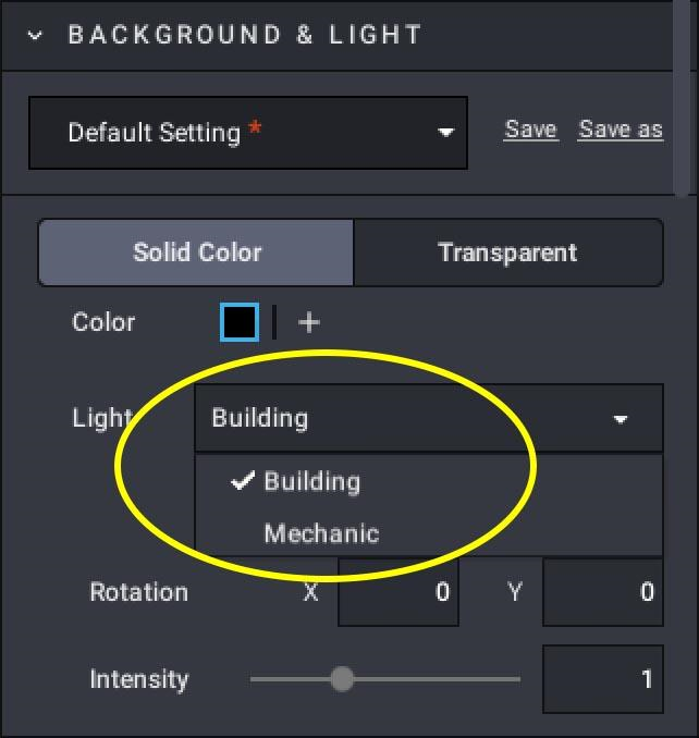
The next selection is the light rig. There are two, Building and Mechanic.
The Building setup has four lights the same size, approximately equally spaced around and set above the scene as shown in the diagram below.
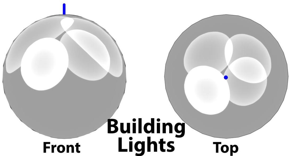
Blue line (left) and dot (right) indicate top, center of light environment.
The Mechanic setup also has four lights, but they are different sizes. They are also approximately equally spaced around, but set at varying heights and two of them overlap. You can see the layout revealed in the spheres below.
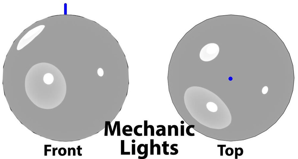
Blue line (left) and dot (right) indicate top, center of scene.
You then choose where the main light (or key light) is placed, left-front, right-front, left-rear or right-rear. This is the primary source of light for the model.
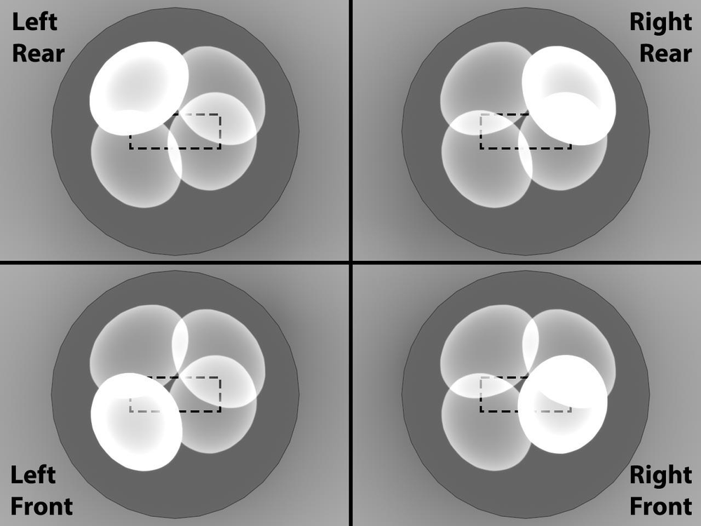
Looking down on the lighting environment, dashed line indicates the scene within the sphere, brightest circle shows key light position.
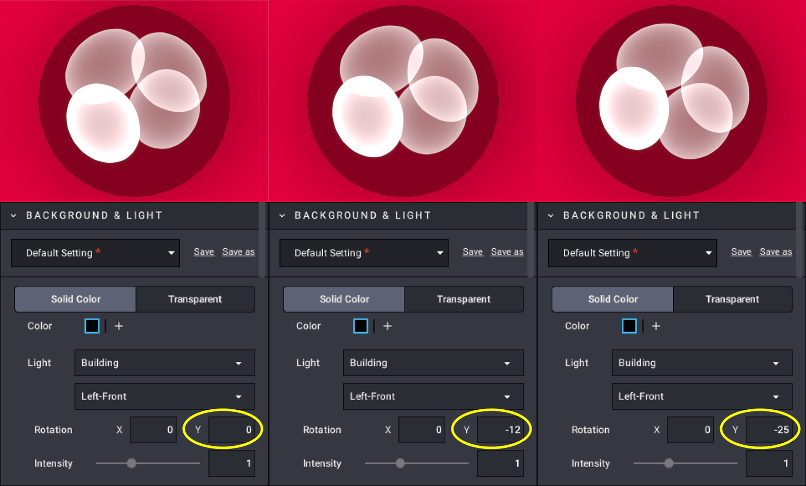
Viewing from above, y-axis rotation.
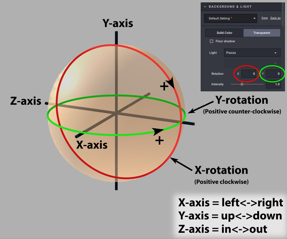
Left front, right front, etc. are the default light setups, but setups can be repositioned by enter values in the X and Y Rotation text boxes.
This is the lighting environment sphere as viewed at a three-quarter angle from an upper left front position. What’s important to note is the direction of rotation when you enter positive or negative numbers for X and Y.
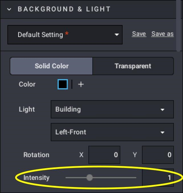
The last adjustment is the brightness of the light.
This process is nice to have for the Solid Color background images, but becomes extremely important when you move to HDRI for lighting.
Now that you know the basics, let’s see what we can do if we stray from the basic software…
Improving BrickLink Studio Renders with HDRI
Using the default rendering setup provided with Studio, you will get an image like this with the building lighting preset:
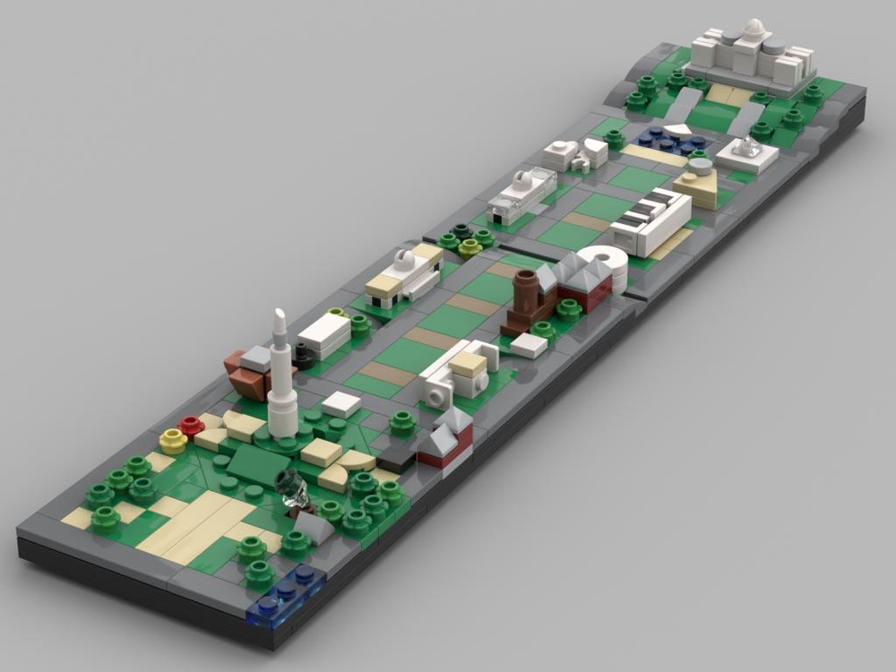
Transparent background, Building lighting preset.
Or an image like this using the dawn lighting preset:
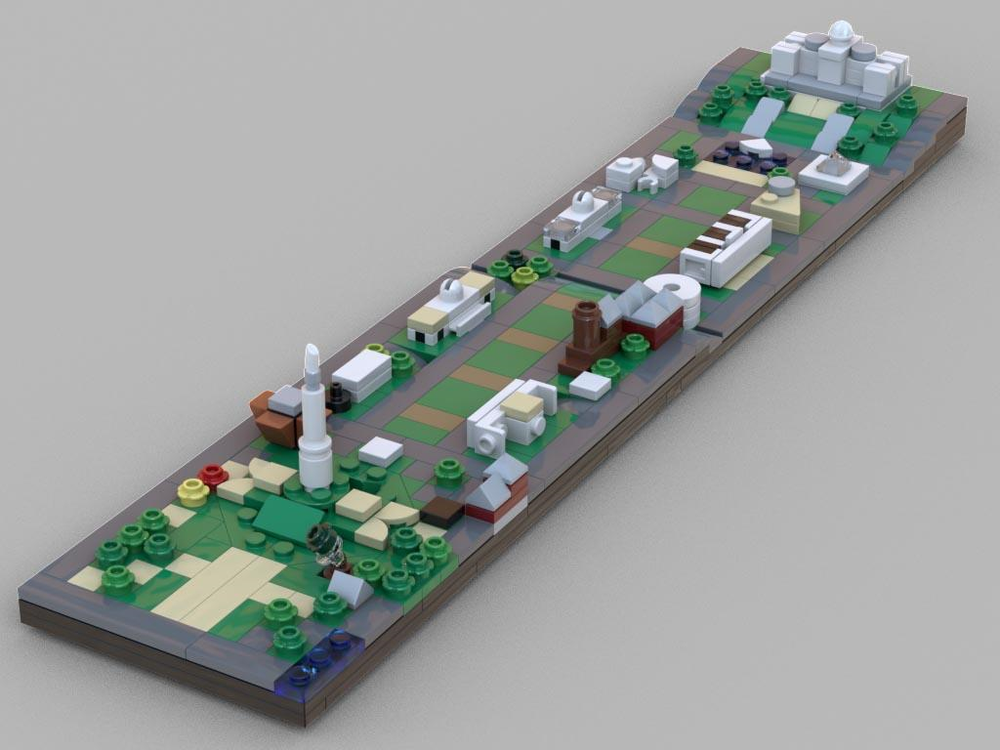
Transparent background, Dawn lighting preset.
Those are both nice looking images, but a little flat and boring. What if you could get something a bit more alive, looking like it was hit with morning sunlight? What if you could get a render like this one":
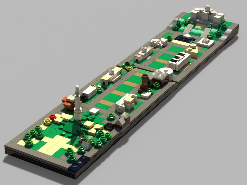
Late morning sun
What if you could make it look like the golden hour during sunset like this?
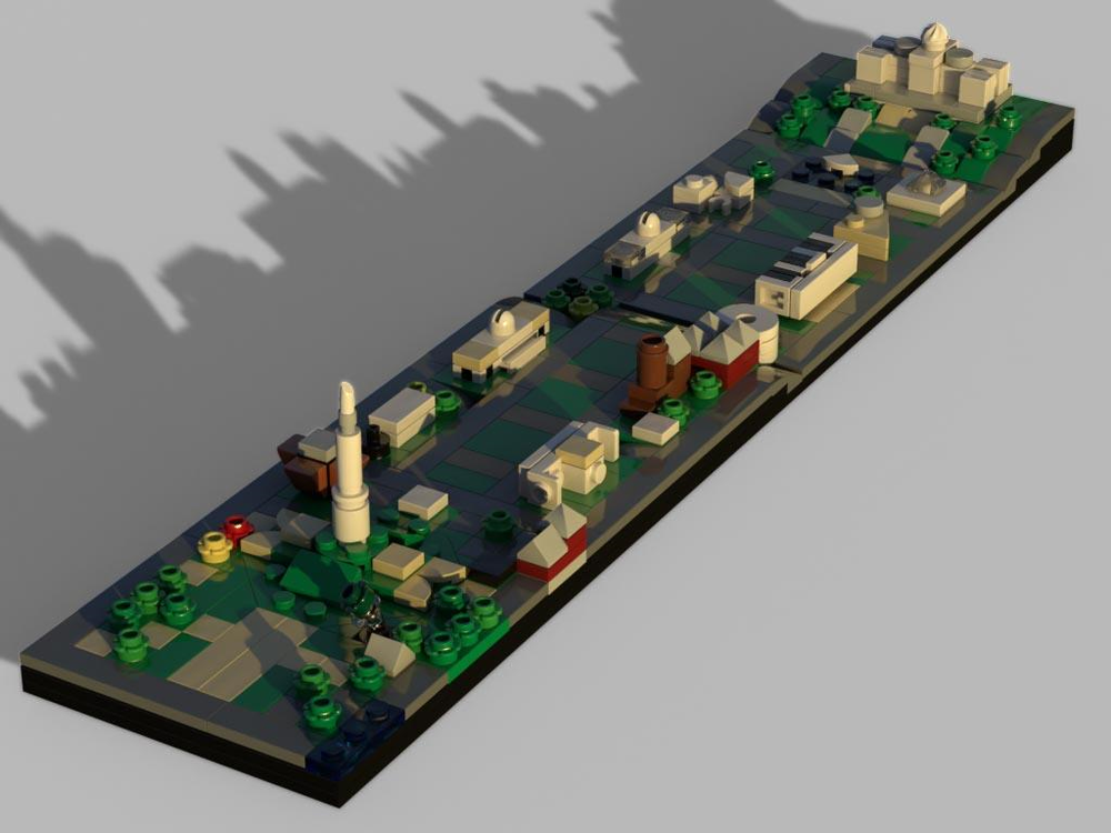
Sunset
Now those images are much more interesting! And getting these looks is quite easy to do. First, a couple of bits of information. To get these kinds of images, the Studio renderer uses HDR images (or HDRI) for lighting. So, what is an HDRI?
Let’s step back for a moment. Most images you deal with, jpegs, pngs, bmps or tifs store color information in three channels: red, green, and blue. Usually, these file formats allot 8 bits of storage for each channel. That means that each channel can store 256 distinct levels of brightness. If the red, green, and blue all have a value of 0, you get black. If the values are all 255, you get white.
Wait… wait, you just said there are 256 levels, what’s with 255. Ah! It’s the way computers count. Rather than go from 1 to 256, computers like to start counting at 0, so for 256 levels, the values go from 0 to 255.
Okay, back to 8-bit colors, or taken together, a 24-bit image. If the red channel has 255 levels, and the same for the green and the blue, the total amount of colors that can be displayed is 256 x 256 x 256 = 16,777,216 distinct colors. That’s a lot of color and works well for most images, especially those displayed on computer monitors and smartphone screens.
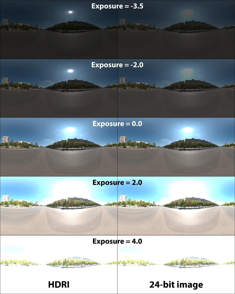
HDRI stands for High Dynamic Range Image. The red, green, and blue channels in an HDR image each use 32-bits to store luminance information. Human vision can’t see that range of brightness, but a computer can use that range to create images.
Here is a comparison of an HDRI (on the left) and its 24-bit equivalent (on the right). As you can see, as you darken the image by changing the exposure level, the bright areas in the 24-bit image gray out, however, with the HDRI you still get a full range of brightness.
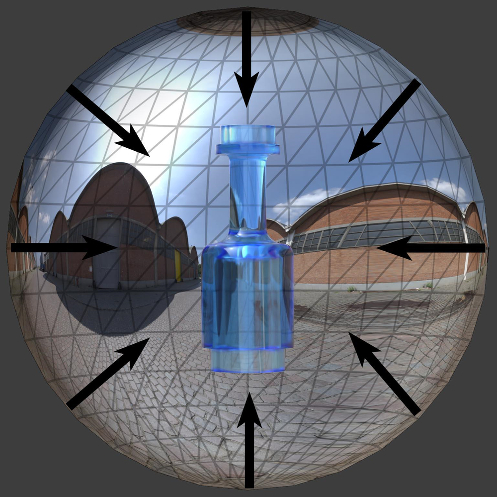
Think of an HDRI not as a photograph but as a representation of the brightness and color coming from the light environment sphere surrounding the scene you are rendering. The HDRI gets placed on the inside of that sphere and your scene gets placed in the center. Each pixel in the HDRI emits a ray of light with a specific brightness and color toward the center of the sphere where your scene resides.
Studio has two default HDR images, TexturesCom_Pano029 and TexturesCom_Pano040. The first is an environment of a town square used by the Piazza and Asteroid presets.
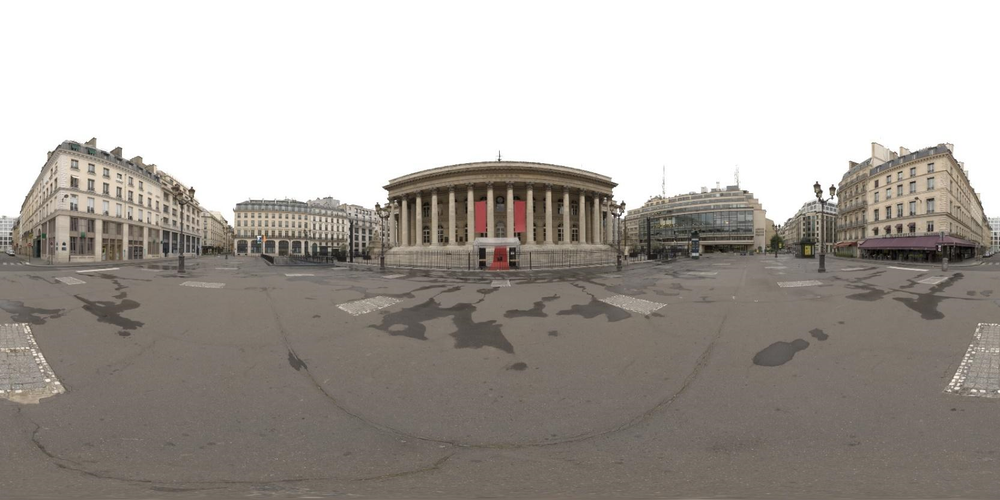
TexturesCom_Pano029.hdr – Used by the Piazza and Asteroid presets.
The second is more of a warehouse area with a brick paved street used by the Dawn preset.
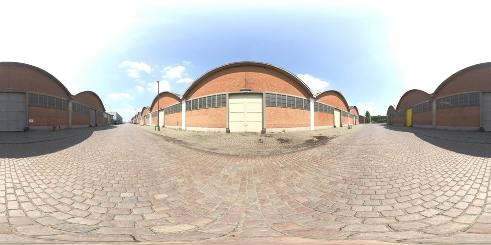
TexturesCom_Pano040.hdr – Used by the Dawn presets.
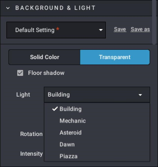
Switching over to the Transparent background setting rather than a solid color, there are now five lighting rig options. Because the background will be transparent, there is no color box or color picker.
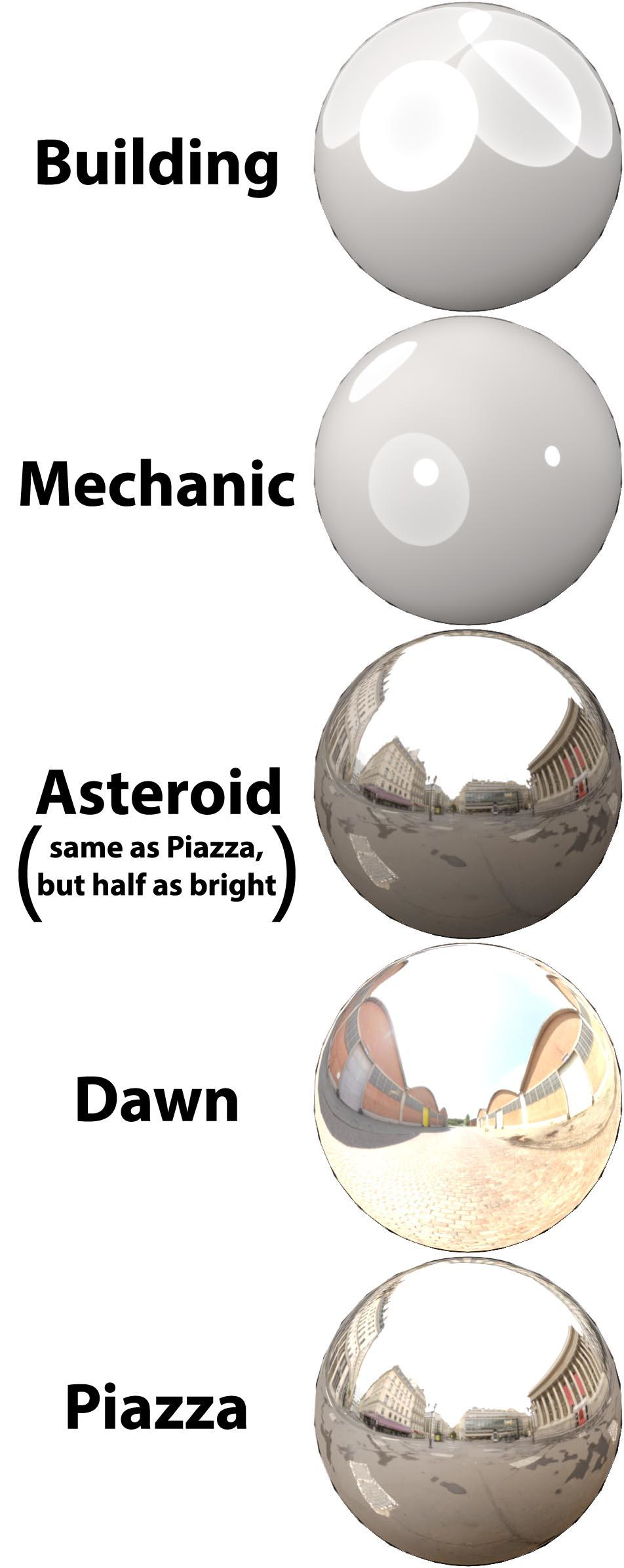
The first two light setups are the same as the two found when the Solid background is selected. The remainder use the two HDR images shown previously. The Asteroid and Piazza presets use the same HDR, but the brightness of Asteroid is half that of Piazza. You could get the same lighting by using Piazza and changing the Intensity setting to 0.5.
Customizing HDR Images in Studio
But what if you want to add your own image for your scene to be reflecting? Though there are many places to get HDR images, a good place to start is Poly Haven, a public 3D asset library. There is a wide selection of free, high-quality HDR images all under the Creative Commons (CC0) license, which means you can use them for any purpose and without having to attribute credit.
I currently have a collection of about 80 HDRIs, of which I use six consistently (for dawn, mid-morning, mid-day, mid-afternoon, sunset and night). I store the images in Studio’s HDR folder where the two default HDRIs are placed: [C:\Program Files\Studio 2.0\PhotoRealisticRenderer\win\64\HDR].
When Piazza is selected for the lighting environment, the renderer uses TexturesCom_Pano029.hdr as the light source. So, the trick to change that picture to something else is to rename another HDR to TexturesCom_Pano029.hdr and it will be used when you select Piazza.
To make things easier, I created a batch file for each HDR that copies and renames the image. I’m lazy and got tired of manually changing the name to the Piazza default HDR.
WARNING WILL ROBINSON! MAKE SURE YOU HAVE A BACKUP OF YOUR FILES BEFORE YOU START THE FOLLOWING!
Here is an example .bat file:
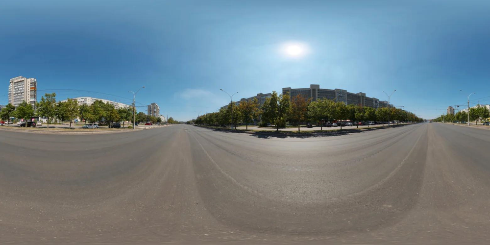
del TexturesCom_Pano029.hdrcopy "C:\Program Files\Studio 2.0\PhotoRealisticRenderer\win\64\HDR\abandoned_parking_4k.hdr" "C:\Program Files\Studio 2.0\PhotoRealisticRenderer\win\64\HDR\TexturesCom_Pano029.hdr"Okay, let’s step through the process of dialing in an HDRI to get a certain look, in this case mid-day. We will use an image called wide_street_01_4k.hdr which looks like this:
The initial default render of our test scene looks okay, but the whites and tans are blown out and far too bright. You will also note that the test scene includes a chrome silver sphere. This allows us to see the positioning of the HDR relative to the scene.
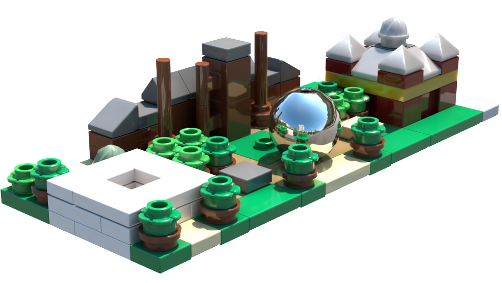
This is the default setup with Intensity=1.0 and X & Y Rotation = 0.
The Intensity needs to be reduced, so I set it to 0.5 and ran the render again.
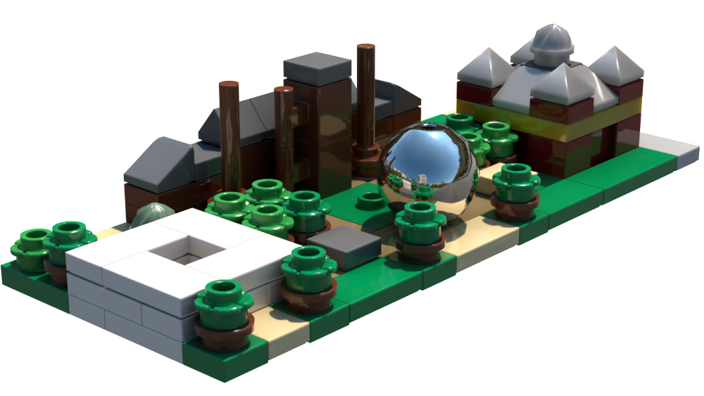
The setup is now Intensity = 0.5 and X & Y Rotation = 0.
This is certainly usable, but I want a little more detail visible in the white pieces, so I then set Intensity to 0.33.
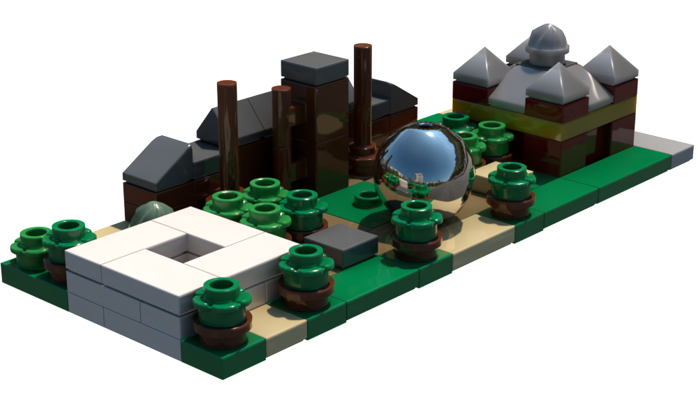
Intensity = 0.33 and X & Y Rotation = 0.
Okay, that image is about where I want it. It could be a little brighter, but let’s move on.
Looking at the shadows and the chrome sphere, you see that the brightest part of the HDR, “the sun”, is above the scene, but angled away from the camera. Because of this, you can’t make out the details on the sides of the buildings… they are in shadow. The position of the sun needs to be changed so the building details can be seen.
Knowing that a negative y rotation will turn the light environment clockwise around the y (or up/down) axis, let’s rotate it by -90 degrees.
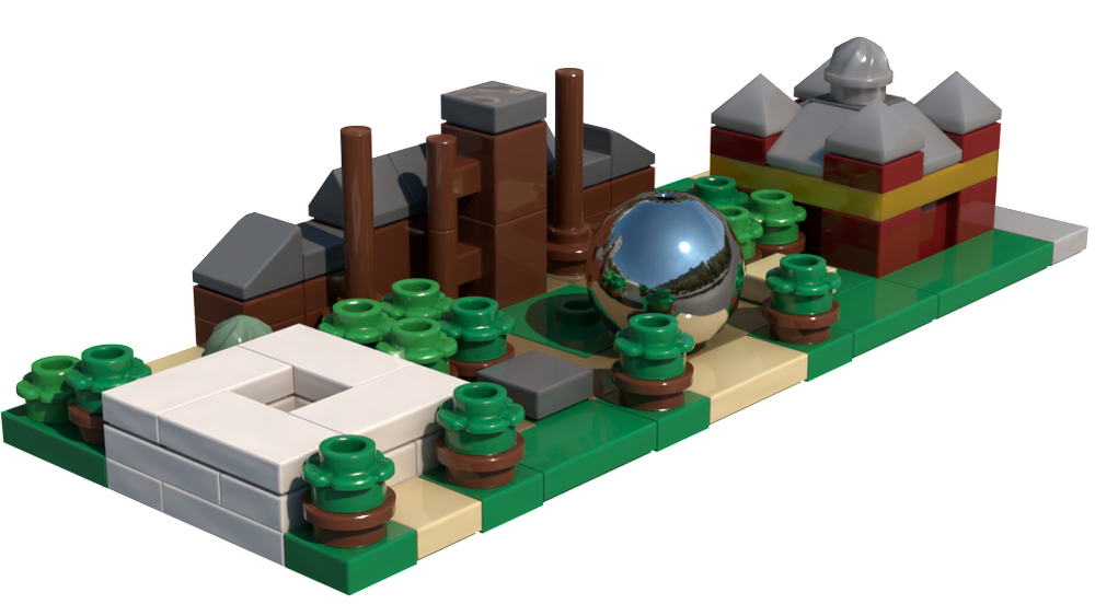
Intensity = 0.33 and X-Rotation = 0 & Y-Rotation = -90.
There! That’s the look I was going for… lit with a mid-day sun that’s dark enough to see details in the white tiles and positioned so the building details are visible.
While we’re here, let’s do a couple more renders to see the difference by just changing the orientation of the light environment. With the y rotation set to 180, you get:
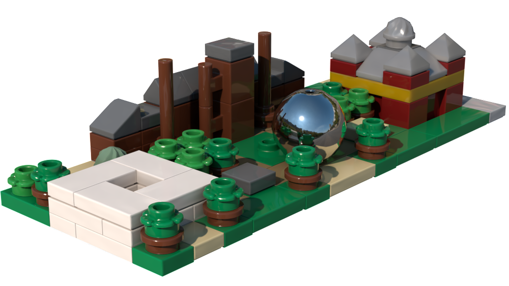
Intensity = 0.33 and X-Rotation = 0 & Y-Rotation = 180.
That looks more like mid-afternoon. Check the chrome sphere to see the location of the sun.
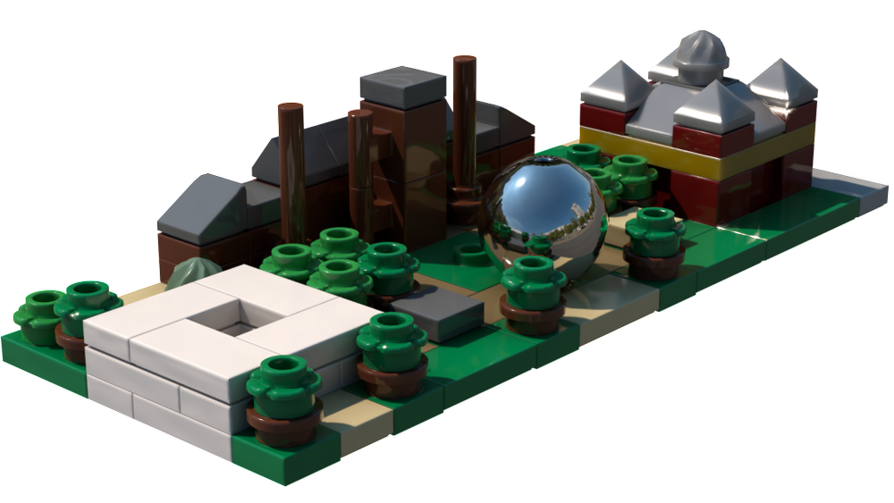
Intensity = 0.33 and X-Rotation = 0 & Y-Rotation = 90.
The render above has a more mid-morning feel. All these looks were accomplished by only changing the intensity and rotating the light environment, to give different looks to your rendered scene.
A Picture is Worth a Thousand Minutes of Rendering
Here are some more renders using different HDR images that you can see reflected in the chrome sphere. Try to look at how the image affects the lighting of the overall model. The first was done with a sunset image.
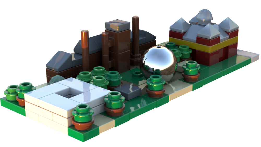
Sunset - Syferfontein_1d_Clear.hdr, Intensity = 1.0, X-Rotation = 0, Y-Rotation = 180.
If you are going for more of a LEGO product look or trying to add a few realistic touches to your render to make it feel more tangible, you can use a studio set-up as your HDR photo.
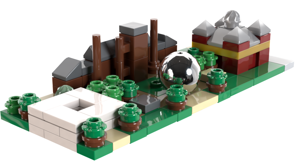
Product shot - Studio_Small_09_4k.hdr, Intensity = 1.0, X-Rotation = 0, Y-Rotation = 90.
Or you can go a completely different direction and light your render in some pale moonlight based on the HDR photo.
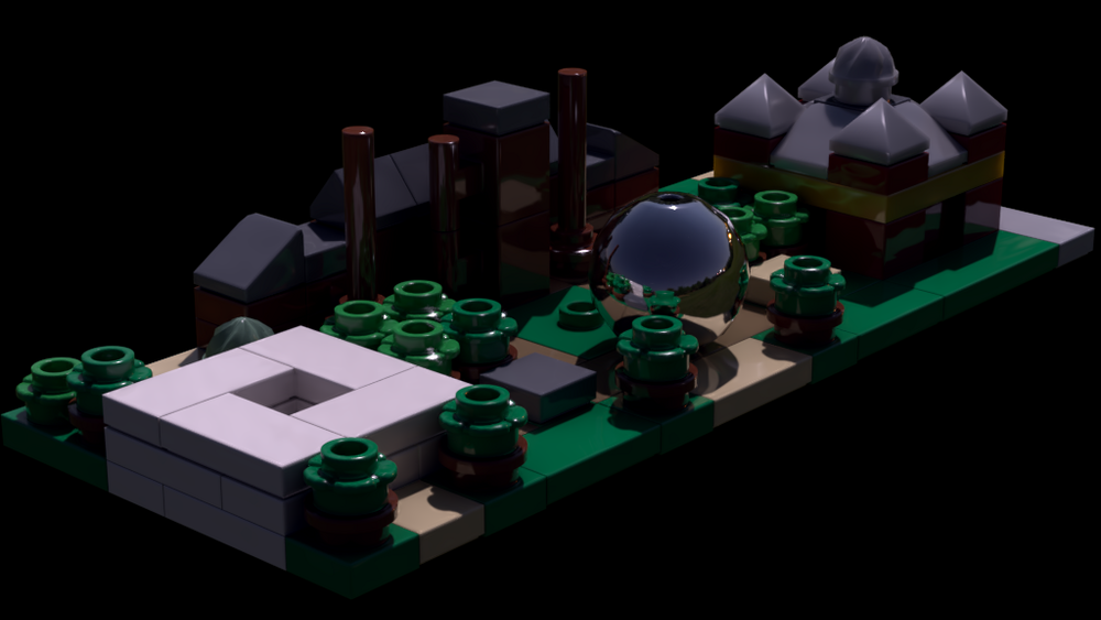
Moon light - Moonlit_Golf.hdr, Intensity-0.5, X & Y Rotation = 0.
For one last run around Studio’s lighting options, here is the same model of the first floor of the Corner Garage modular, rendered with six different HDRI options. See how each of the lighting setups makes you feel when you look at the final render for each.
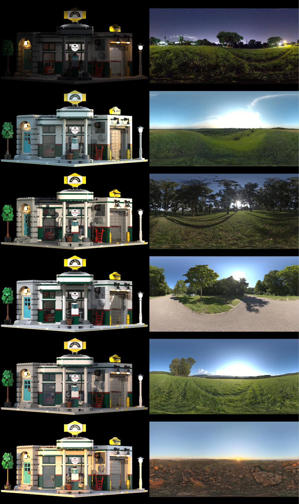
There you have it. The pictures speak for themselves. Hopefully this hacking guide provides you with the information you need to show your BrickLink Studio prowess and unleash your inner lighting expert. So what are you waiting for? Go start creating some unique and memorable well-lit renders!
How have you hacked BrickLink Studio? Let us know in the comments below.
Do you want to help BrickNerd continue publishing articles like this one? Become a top patron like Charlie Stephens, Marc & Liz Puleo, Paige Mueller, Rob Klingberg from Brickstuff, John & Joshua Hanlon from Beyond the Brick, Megan Lum, Andy Price, John A., Lukas Kurth from StoneWars, and Wayne Tyler to show your support, get early access, exclusive swag and more.

