Expanding the Palette: Options For The Next LEGO Color
Introduction

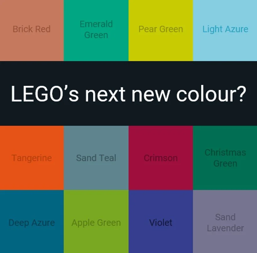
The current LEGO colour palette contains just 44 solid colours, making the release of a new colour a pretty big deal.
With the introduction of three new colours in 2022, The LEGO Group has clearly demonstrated its commitment to investing in new colours where it improves the product, and the build experience.
We’ve also seen the issues caused by having too many colours, with the need to rationalise the palette in 2004. But today, we are going to throw all those real-world constraints out of the window, and have some hypothetical fun looking at gaps in the current palette, and speculate which of those could be filled by colour number 45.
44 Solid LEGO Colours of 2023

Colour Resources
This article is a follow-up to the LEGO colour palette deep dive we performed earlier in the year. We covered a lot of colour theory, obtained close to accurate RGB codes for each LEGO colour, and organised them logically based on hue and lightness, as seen in the diagram above.
Other excellent resources are Ryan Howerter’s stunningly comprehensive LEGO colour table (Ryan is also an expert on LEGO plastics too) and Tom Alphin at Brick Architect with his articles on Understanding the LEGO Colour Palette and Hard to Find LEGO Colours.
Real World Constraints

Image sourced from Envato Elements under Licence
Before we jump into the analysis, I just want to again highlight that today’s exercise is a bit of fun, and is not to hubristically propose a whole raft of new colours.
I suppose most LEGO enthusiasts would welcome new colours, and undoubtedly a wider range of colours would allow even more realism in the models, but unfortunately in the real-world, each new colour incurs a cost.
Not only that, but as it was pointed out by my colleagues here at BrickNerd, new colours can also adversely impact the user experience, especially in regard to being able to differentiate between similar colours both in real bricks and instructions.
Disappointingly, these constraints mean there is effectively an upper limit to the number of solid colours the LEGO palette can accommodate, and there’s a decent chance we are nearing that limit now.
But like the speed of light, a bewilderingly slow speed limit that prevents us from getting to Alpha Centauri and other exotic solar systems, there’s no harm whatsoever in pretending this constraint doesn’t exist, and spend some satisfying time wondering ‘what if?’
Colour Theory Recap
We won’t delve too much into theory today, but here is a quick summary of what was covered in the previous article:
RGB, HEX, and HSL (Hue, saturation, lightness) are all different ways of expressing the same colour.
We are most familiar with the RGB codes we see daily on our computers, which generate a combination of 16.5 million unique colours within the sRGB colour space.
HSL (Hue, Saturation, Lightness) is the most intuitive model for visualising colours, as its structure makes it much easier for humans to predict the colour from its numerical values.
All colours are not created equal, and human perception of colour differs from the formulaic approach HSL, HEX, and RGB use. For example, we find it easier to differentiate between shades of Orange, than to shades of Green.
This is likely due to evolutionary factors, for example, being able to pick out tasty fruits from the expansive green background of the forest. It also probably helped us spot unwelcome predators that may be looking for ‘tasty fruits’ of their own!

Image sourced from Envato Elements under Licence
Human Perception of Colour
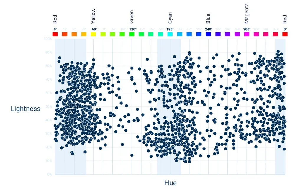
The discrepancy between the mathematical approach used by HSL, RGB, and HEX and how humans perceive colour can be seen clearly in the following chart, which plots all of Pantone’s c.2,400 spot colours by Hue and Lightness.
PANTONE Formula Guide Colours plotted by Hue and Lightness

If human colour perception was the same as the HSL/RGB formulaic approach, we would expect all of Pantone’s colours to be distributed evenly across the colour space. However, there are clearly distinct clusters in the areas where we are better at differentiating between different shades.
This is important because it means we can’t just use the HSL colour space to identify gaps in the palette, as it will be biased towards colours we are less capable of seeing. Instead, we need a framework that allows us to identify gaps based on how we actually perceive colours.
The Natural Colour System
The Swedish Natural Colour System (NCS) solves this problem, offering several advantages over the traditional RGB / HSL approach. It is designed to be ‘perceptually uniform’ meaning the numerical steps between their defined colours represent the same steps we see as humans.
It consists of four primary colours - Red, Yellow, Green, and Blue - each equal distances apart. These primary colours are then mixed to produce a total of 40 distinct hues, as seen on the wheel below.
40 NCS Pure Hues Mixed from Red, Yellow, Green and Blue

Source: Natural Colour System
Exploding Hues
White and Black can then be added to each of the 40 hues to adjust their lightness and saturation, producing an underlying ‘triangle of possible colours’ for each of the 40 hues. The following diagram shows how the Green hue is expanded into its several different shades.

Source: Natural Colour System
I’ve translated each of the 44 Lego colours to colours in the NCS colour space, except for the four monochrome colours - White, Light Bluish Grey, Dark Bluish Grey, and Black - which are dealt with separately below. Also, it wasn’t possible to plot Neon Yellow, so I did what all good scientists do…ignored it.
This translation wasn’t an exact process, but close enough to plot our colours roughly where they should be, still allowing us to identify gaps.
Round 1 - Monochrome / Greyscale Colours
The four current LEGO monochrome colours are nicely spaced, with the two Grey colours placed almost equal distance between the White and Black extremities. I’ve added three additional Grey options on the right, using the same approach, keeping the colours equidistant apart.
The naming convention would be straight forward as well, giving us, Very Light Bluish Grey, Medium Bluish Grey, and Very Dark Bluish Grey. Clearly, the introduction of these colours would improve the level of realism across many ‘Grey Heavy’sets, but given how close the appearance of the revised shades are to each other, it would make it difficult to see the new ones being added to the LEGO palette.

Percentage Lightness shown Next to Each Colour
The Star Destroyer Conundrum
We’ve had Very Light Bluish Grey before, introduced as part of the 2004 ‘Great Colour Change’, c.50 parts were made, including Bionicle, Technic, and an endearing cat. But alas, it lasted just eight years before it was retired, and perhaps more ominously, not replaced.
I didn’t want to comment too much on ‘real-world’ reasons why a colour may be introduced, I just wanted to present the gaps, and let you the reader enjoy picking your own favourites.
…but then there’s Star Wars.

Image © Lucasfilm
A lot of Star Wars ships fall somewhere on the spectrum between White, and Light Bluish Grey, but designers have to make a call on which of these two extremes to go for.
75302 Imperial Shuttle (which I bought for our child) and 75252 UCS Star Destroyer (which I bought for me, before stealing the Imperial Shuttle from said child as well), are both Very, Very Light Grey in the films, much closer to White than Light Bluish Grey.

Images © THE LEGO GROUP
The White Imperial Shuttle more faithfully represents its appearance in the films, but despite this, I’ve never quite got on board with the way it looks on display, which is a shame as it’s a nice technical model and play set.
And of course, the Light Bluish Grey Star Destroyer is less faithful to its colour in the films, but is so much the better for it…I don’t know for sure, but I suspect a White version would be much less attractive, and similarly, turning 75192 UCS Millennium Falcon White, would clearly be sacrilege.
Does a version of Very Light Bluish Grey help improve the visual appearance by adding an extra option? I have no idea, but I suppose any significant improvement on the already excellent UCS sets would no doubt get more than a few people (including myself) reaching for their pockets for the upgrades.
Round 2 - Low Saturation / Sand Colours
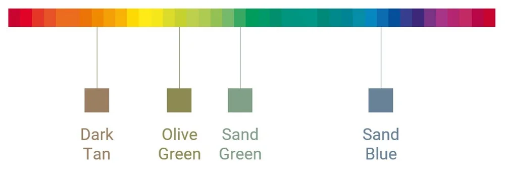
The LEGO colour palette has four colours with very low saturations, giving them a dull, yet more realistic appearance. Dark Tan, Olive Green, Sand Green, and Sand Blue are plotted below against the NCS hues, letting us see the gaps where potential new colours might sit.
Note - Olive Green is technically ‘Sand Lime’…Yuk! Full marks to the team at LEGO that avoided picking that ‘less than optimal’ name.
The Four LEGO Low Saturation ‘Sand’ Colours

Brick Red
Some of the alternative Sand Colours are stunning. Their muted, low-key appearance (nature) differers significantly from highly saturated colours such as Red, Yellow and Lime that are more prominent in sets designed for a younger audience (nurture).
Options for Low Saturation ‘Sand’ Colours

Sand Red is an old favourite that needs no introduction, but it is Brick Red that seems to be a more popular choice with some of our resident Nerds. And I guess that makes sense when you compare the possible uses of Brick Red to Sand Red.
Traditional English Town house in Brick Red

Image Sourced from Envato Elements under Licence

Red brick buildings and houses are popular worldwide, especially in the former industrialised cities of Liverpool and Manchester in the North of England, which I can personally confirm.
The style isn’t just confined to homes in the UK, as several stunning larger red brick buildings were built during the Victorian period. Universities founded in the late 19th and early 20th centuries are coined the ‘Red Brick Universities’, and visitors arriving by Eurostar at St Pancras Station are greeted with its superb red brick edifice.
I think what I’m trying to say is that just in the UK alone, there are several buildings whose LEGO model would benefit substantially from the introduction of that colour.
St Pancras Station, London

Image Sourced from Envato Elements under Licence
Anyway, let’s move on from my paid promotion for VisitEngland, and briefly mention Sand Aqua and Sand Teal, both of which are much more elegant than I anticipated, and would be especially versatile for increasing the realism of water scenes, such as the combination with the Brick Red sand below.

Image Sourced from Envato Elements under Licence
Best of the Rest
Monochrome and Sand Colours have distinctive features, making them much easier to analyse them separately, away from the main colour palette. But now we have dealt with them, we can turn to the remaining 36 colours, and see how they all fit together within the NCS Colour space.
36 LEGO Colours Plotted on the NCS Colour Space

To produce the chart above, I identified the NCS Colour that best represents each LEGO colour, then plotted them by their NCS hue, and estimated their lightness on a scale of -10 (black) to +10 (white) based on their position within the NCS colour space.
I was a little concerned that the LEGO colours would be spread uniformly across the chart, but to my great relief (as it was the whole point of writing this article), there were gaps…lots of lovely gaps!
Round 3 - The Greens
The charts that follow show options for new (or returning) colours, and their relationship to the colours currently on the LEGO palette. It is high level, and not a comprehensive list, but each colour has been selected to ensure most areas of the colour space are represented. That said, I’m still attempting to force a three-dimensional space into two dimensions, so a little artistic licence was still required.
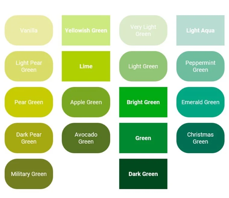
Current LEGO colours are shown in the rectangles, and new colour options are shown in the rounded rectangles. I’ve made up the names myself, and some names may be the same as past retired colours, but I’ve tried to keep these to a minimum and attempted to stick to foodstuffs were possible.

Light Green and Very Light Green combine well as lighter shades of Bright Green, Green, and Dark Green, a job currently being completed by Yellowish Green and Lime.
The retired lime colours closely resemble some of the Yellowish-Green colours displayed in the left-hand column.
The darker shades of Light Aqua - Peppermint Green, Emerald Green, and Christmas Green -are a family of colours that have virtually no close comparisons with the current, or retired LEGO colours.
Round 4 - The Blues
Deep Azure is a very interesting colour, reminding me of the cold Arctic sea. It belongs in the same family as Medium Azure and Dark Azure, and is differentiated well from Dark Turquoise and Dark Blue, helping to retain its uniqueness.
Several violet colours have been produced before by The LEGO Group before being replaced by the Lavender colours, and it would be a surprise to see any return.

Round 5 -The Reds
The red section of the colour palette is already pretty crowded, but there are still some interesting variations, including the Crimson and Vermillion families, which sit either side of Red.
Rose, Dark Rust and Light Salmon all closely resemble retired colours.

Round 6 - Oranges & Lemons
The Orange section is the most densely populated region of the LEGO colour palette.
Golden Brown is a colour that stands out, giving a much warmer feel than the current inventory of browns.
Tangerine is also a nice option, straddling the fence halfway between Orange and Red.

Concluding Thoughts
We’re back in the real world now, which means an acceptance that we can’t travel faster than light, and that most of these colours we’ve seen today will never make it into the hallowed moulding machines…but that was the point of this exercise, to look at the possible, not the probable.

Image sourced from Envato Elements under Licence
Rather than trying to predict a few colours that could be released in the future, or self-indulgently list the colours I would like to see produced, I wanted this to be a global exercise, trying to cover as many ‘colour bases’ as possible, using a logical and methodical approach, then leaving it up to you the reader to pick your favourites.
My own main takeaways from the exercise are:
The realisation that colours need to be easily differentiated in both the bricks themselves, and the instructions, mean there is an upper limit on the number of colours that could ever be produced (unless that constraint is removed).
The Natural Colour System rules, but I’m an accountant trying to pass myself off as some colour guru, so I suspect to most people in the creative industries, it’s just a standard tool.
Very Light Bluish Grey could be a useful colour for Star Wars in particular, but its removal from the palette indicates that the chances of a return are limited, especially if it is difficult to differentiate it from White easily.
There are several nice looking options for Sand Colours, but consensus indicates Brick Red would be the most useful for enthusiasts, especially with the large number of Red Brick buildings located around the globe.
I’ve taken a birds-eye view of the rest of the palette, filling the gaps to show a decent selection of colours that could be introduced. It is by no means comprehensive, but still gives us a good idea of what may come next, unless it’s something like Neon Yellow, then all bets are off.
Thank you for reading, and if you enjoyed it, I would recommend our previous article on the LEGO colour palette from January this year. I hope the colours identified generate some interesting discussion and debate, for which the comments section below is primed and ready to go…
…and don’t forget to keep a close eye out when picking those ‘tasty fruits’ in the forest.
What are your thoughts on the LEGO color palette? Too many? Not enough? Let us know in the comments below!
Do you want to help BrickNerd continue publishing articles like this one? Become a top patron like Charlie Stephens, Marc & Liz Puleo, Paige Mueller, Rob Klingberg from Brickstuff, John & Joshua Hanlon from Beyond the Brick, Megan Lum, Andy Price, John A., Lukas Kurth from StoneWars, Wayne Tyler, and LeAnna Taylor to show your support, get early access, exclusive swag and more.

