All Types: Behind the Design of LEGO Typography

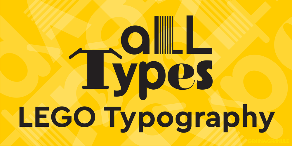
Bonus points if you can work out which fonts have been used. Hint, all have been used by LEGO and some can be found below!
In the last couple of years, you may have noticed the boxes, instructions and LEGO website looking a little different. A small facelift perhaps? What you might’ve seen but not realized is that LEGO is now almost fully switched over to a new brand font. Cera Pro is now in full flight within the brand, and I have one main theory as to why I believe this switch was enacted. Other than shaking up the style a little with Cera Pro’s slightly playful characters, accessibility is its strong suit.

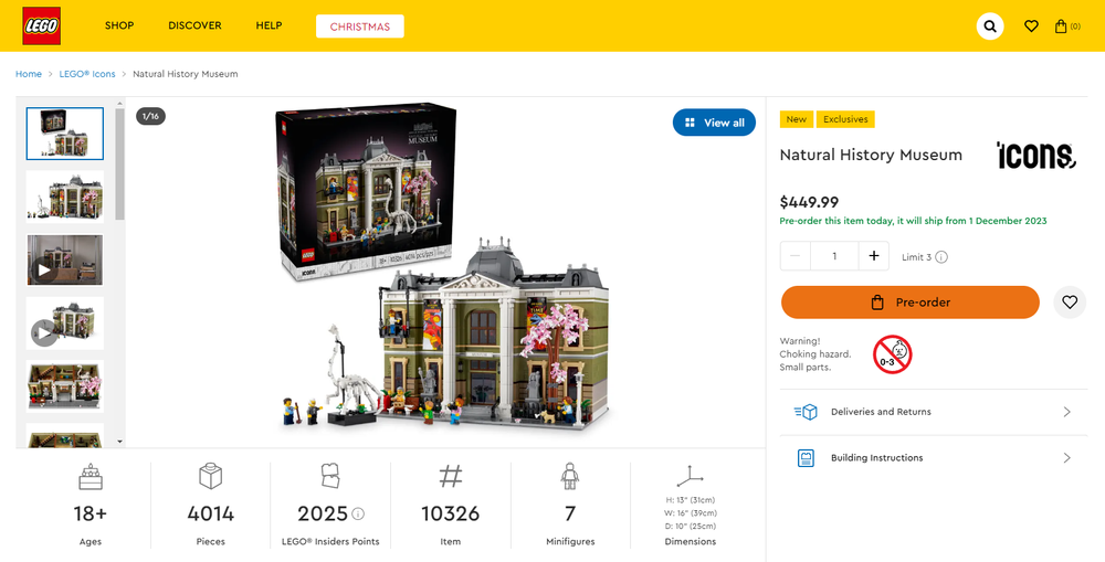
The website now follows the same typographic choices as the packaging; not previously possible with Chalet.
Cera Pro in its entirety supports more than 270 languages with its Cyrillic and Greek character sets, allowing for a far greater reach to kids and adults around the world. I think this is a really positive change for the company and reminded me of a study I did some time ago regarding the history of these font choices and their surrounding artwork. I think it’s time to take another look at LEGO typography!
Chalet - 2002

Courtesy of Gerhard huber
Have you ever wondered what font used to be used on LEGO boxes? Chalet! Have you wondered what was used on any official signage for that matter? Chalet! Anything to do with internal communications and official press material? Chalet!
Chalet, released in 1996, is the company’s current font family of choice, and it all started in 2002 when Chalet ‘NY1960’ was first used on boxes. This was a way to standardize and simplify the design process for this sort of material—at a time when the company was overcomplicating many processes. With a wide-ranging condensed to extended font family, Chalet allows consistency in its flexibility.

I dare say this may have been one of the changes former CEO Jørgen Vig Knudstorp put in motion, as was his approach at the time to streamline workflow and production.

Courtesy of Ebay User: CapeFEARGAMES
Looking at the boxes of the time, a solid bar of one unique colour brackets one or more edges of the box to show what theme it comes from. A dynamic background breaks through from the rear illustrating the set.
You will find it’s only been within the last decade that any major change has been made away from this layout standard, both in Creator and other themes. As the brand’s image gets stronger, their reliance on these devices becomes less of a necessity. They often get reinterpreted like the black backgrounds for 18+ sets.

Kabel - 2001
Next up I’ll be looking at the box that set the standard… for the standard, the first Creator sets!


Simplified from the video game logo from some years prior, the original Creator logo was playful but still regimented, working in that all important system. The Kabel typeface revived by ITC in 1975 has its roots all the way back in 1927, with its angled strokes and single width structure baring the characteristics of a chisel-tip pen. It was designed to attract attention as a display font, and that’s exactly what it does in the Creator logotype.


It was certainly a quirky choice!
The dynamic green sweep that envelops this box design was carried through into the more modern Creator sets seen earlier. The placement of the set number, this time in Franklin Gothic, also allows it to start resembling the sets we see today.
The green colour may have been a choice to let it stand out from other LEGO themes at least, but given how short-lived this design was, I think they got the idea that it wasn’t quite striking enough on the shop floor with other toys. (Humble beginnings, we’ll call it.)
Volkswagen Auto Group Rounded - 1995
Next, I’ll take a stab at some paintings and illustrations because I think it’s time to go ‘Freestyle’. =D


If you hadn’t noticed, both the SYSTEM graphic and the set number bear the same typeface! VAG Rounded was a typeface commissioned for Volkswagen in 1979 to sort of be to type what the VW Beetle is to car parks. The font is friendly, approachable and welcoming, and once it was public ten years later, it became rather popular due to its inclusion in a range of computer software. (Think Comic Sans, but classier!) I suppose the thought is if there are no sharp edges, you have an incredibly non-threatening font… and kids may have gravitated toward it.

You could not get a more ‘juvenile’ design style unless you stuck some Cooper Black fridge magnet text on the background! This theme was meant to be the embodiment of the ‘just roll with it, have fun’ idea LEGO often enjoys. Think of this as Building Bigger Thinking’s little brother. A hand-painted (and digitised) background, brick piles, a hand-written theme name, and a wonderfully round set number font all combine to create this vibrant and kid-friendly box art. The essence of this style can still be seen in early Creator sets. A font this striking was needed to lure kids away from the video game aisles in the late 90s.
Everything in this design says ‘Look at me,’ but not in an obnoxious way. It speaks to a more casual, fun-filled adventure of building, trying to reassure that the system isn’t so restrictive.
Every Character Counts
There are plenty more great typographic choices made over the years, with some obvious and not-so-obvious fonts. (Next time we’ll wind back the decades and get Classic!) But looking back, LEGO’s typographic evolution—from the standardized Chalet to the playful Kabel—mirrors its journey of innovation. In a way, each font choice reflects the brand’s evolving image. The shift to Cera Pro particularly highlights LEGO’s recognition of the importance of cultural inclusivity and accessibility in today’s connected world. From bricks to fonts, LEGO’s typography shows that packaging and branding can be a playfield for “All Types” where every character counts.
What’s your favorite LEGO box artwork? Want to know what font was used? Leave your thoughts in the comments below.
Do you want to help BrickNerd continue publishing articles like this one? Become a top patron like Charlie Stephens, Marc & Liz Puleo, Paige Mueller, Rob Klingberg from Brickstuff, John & Joshua Hanlon from Beyond the Brick, Megan Lum, Andy Price, Lukas Kurth from StoneWars, Wayne Tyler, Monica Innis, Dan Church, and Roxanne Baxter to show your support, get early access, exclusive swag and more.

