All Types, Part 2: Behind the Design of LEGO Typography


Welcome back to All Types, a look at the typography of LEGO. This time around, we’ll travel back through time from the beginning of the 90s all the way to the 60s. This round of typefaces seems to have some commonality—but stick around ‘til the end where I look at a very funky personal favourite!
For readers who haven’t seen the previous entry in this mini-typographic deep dive, go and check it out! For those of you who have, this time around I’ve attempted to credit the designers responsible for the typefaces shown. They all have their own equally rich history that should be remembered.
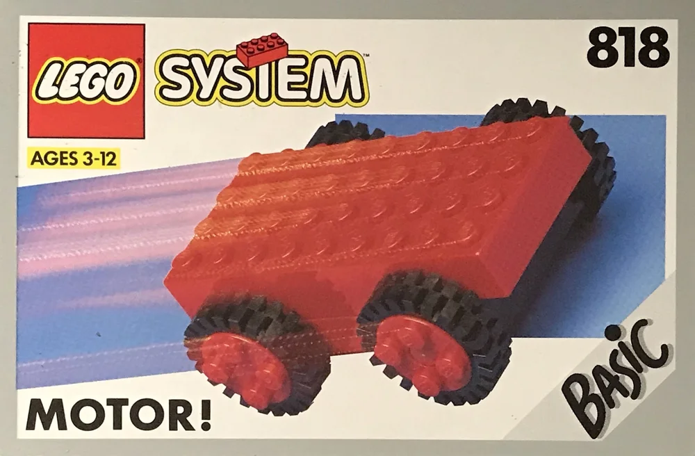
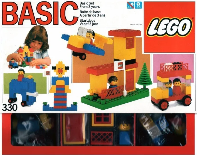
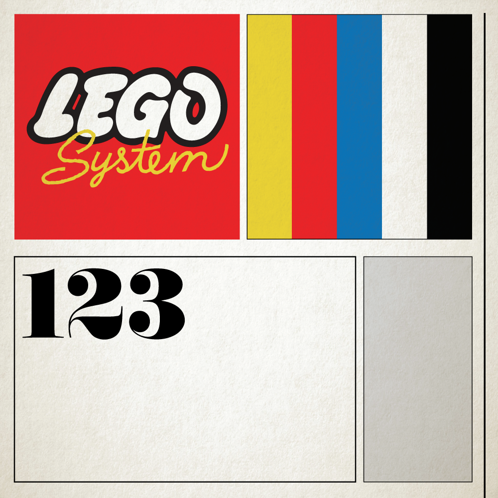
Futura - 1992 Basic Range
Futura, my guilty love, showed itself in box art. It had been used previously in this same Basic range but I chose to focus on the first sets with the System graphic, an iconic feature of this age. Futura is the ‘go-to’ clean and modern typeface. Its sparing use solely for the numbers and production info on the boxes allowed it to sit neatly with the rounded lettering seen elsewhere on the box.
COURTESY OF BRICKSET
With all the different previous iterations of design in this theme, the box became cluttered so easily. Shadowed backgrounds became superimposed gradients, and the age guide was pushed all the way down to make room for the Basic tag that was kicked off its pedestal once LEGO System came in. Everything felt like it was just band-aiding older styles.
You can see what a difference this and the following Basic set have between them, but I suppose it’s a good point in the evolution of the Basic range.
Next we arrive at the origins of the Basic theme as we hit the 80s, colour and all.
News Gothic - 1985 Basic Range
If you’ve ever seen the ABBA logo, you’ve seen News Gothic. In this use case, the font was perfect for the box in that it shared the qualities of the theme: a basic, easy-to-understand system. It’s readable; it’s no-nonsense; and, being relatively unknown to the public or entry-level designers, the potential for critique is rather minimal. It was just simple.
COURTESY OF BRICKSET
The box itself became a bit of a collage of the set information, set contents (seen through a nifty transparent window), and a plethora of build suggestions and ideas scattering the entire rest of the box.
Instead of backgrounds, the designers just used solid blocks of colour. I imagine there was at least some system in place for colour choice, but aside from a slight grid system, it all seems just a bit much.
I tried to see what was happening internally at the time around the early 80s to see why this aesthetic might have been lacking compared to previous and future references, but it looks like of the 5,000 people were employed in 1985, no one documented this—surely someone could’ve put their two cents in!
We are at the end of the first half and checking out the 70s. Now we are getting closer to the really special stuff! Are you with me so far? We’re halfway there!
Helvetica - 1973 Universal Building Sets
In my mind, 1973 solidified LEGO’s reign as a global empire. In years prior, the company extended its reach to the far east, a new factory opened, a dedicated PR department was set up, and the license agreement they had with Samsonite in the US ended. In ’73, LEGO USA was established in the Connecticut HQ, and the new logo came in to unify all LEGO media. It was here that the company proclaimed it was here to stay and ready for the future with Helvetica.
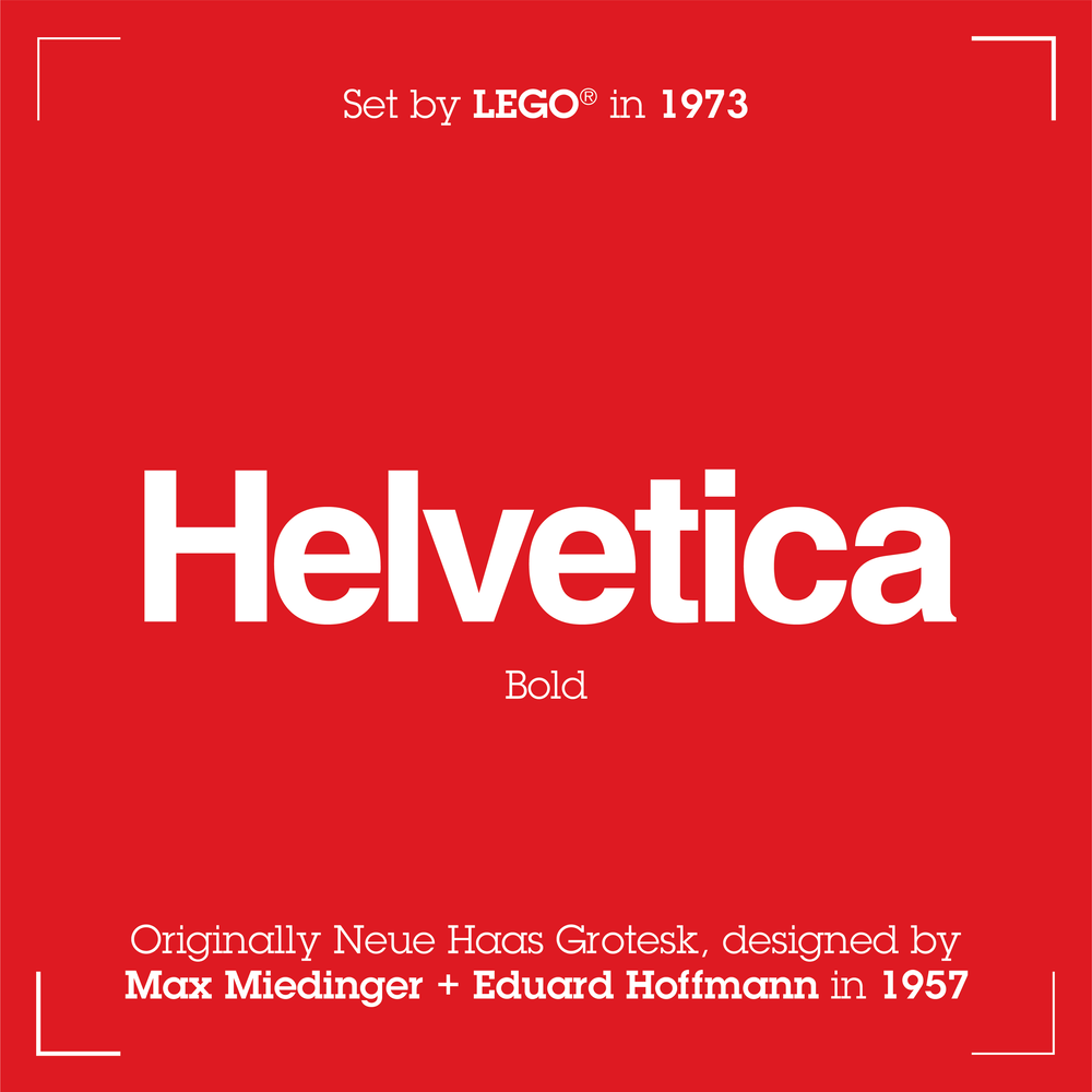
Helvetica became the house typeface with ‘Legoland’ sets, ‘Universal Building Sets,’ and the new LEGOLAND Sierksdorf park entrance, all sharing the Swiss-type staple. This and a grid structure that allowed all box sizes to follow suit meant consistency at a global scale in media, marketing, and retail presence.
View fullsize
View fullsize

View fullsize


This now marks the beginning of the modern era for LEGO box art. Onward to the old stuff! 😃
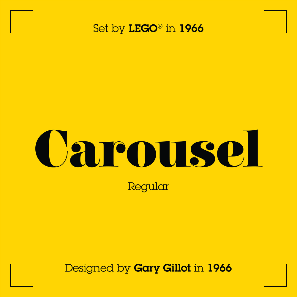
Carousel - 1966 Basic Building
I will now take you a bit back in time to reintroduce to you the charming train era, with one of the funkiest type choices seen so far!

Courtesy of Geograph
This era focused heavily on trains. Whether it be the carriages themselves, supplemental track sets, or accessories for a layout, almost all sets at this point in time were geared toward trains in some way or another.
It’s no surprise then that the beautiful ‘Carousel’ fat-face type from the same year was used. Not only was it fresh at the time and popular for advertising, but it also bore a resemblance to the numbers painted on train carriages throughout Europe!

COURTESY OF BRICKSET
The layout was a fairly well-crafted series of structures designed to be replicated on any box size.
The photographed contents on a dimly lit surface evoked the appearance of your living room table or your attic space play area.
The boxes of this time were also some of the first to have a proper scheme for age differentiation with cute little stick-figure family charts that showed how appropriate a set was for certain ages.
All of this allowed for some brilliant store displays in the toy aisle with a consistent and attractive presence. It was certainly one of my favourites, and definitely a special time for 60s LEGO fans.
Font of Personality
It’s quite fascinating to me to see how these seemingly small design choices to the average viewer can have a great impact on the personality of the box. Not just in the type, but in the structure, the framing, and colour choices. Each piece of packaging iterates off the last, taking some elements and reinventing others to focus more or less on any given detail.
In the final installment of this mini-series, I’ll be going all the way back to the beginning, finding the typeface that the original LEGO logo was set in—the sort of thing only a BrickNerd could appreciate!
Do you have a favourite font from a LEGO set you want identified? Let us know in the comments below.
Do you want to help BrickNerd continue publishing articles like this one? Become a top patron like Charlie Stephens, Marc & Liz Puleo, Paige Mueller, Rob Klingberg from Brickstuff, John & Joshua Hanlon from Beyond the Brick, Megan Lum, Andy Price, Lukas Kurth from StoneWars, Wayne Tyler, LeAnna Taylor, Monica Innis, Dan Church, and Roxanne Baxter to show your support, get early access, exclusive swag and more.