All Types, Part 3: Behind the Design of LEGO Typography

We come to the end of this mini-series on LEGO typography by peering right back to the beginning of the LEGO company to see how the brand image began. The further down in the article, the further back in time we go.
In this final installment, you will see how the company found a system in packaging amongst their system of play, as well as a few bonus round entries for good measure, sure to delight the inner child!
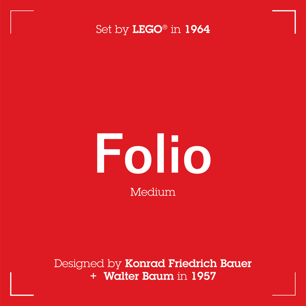
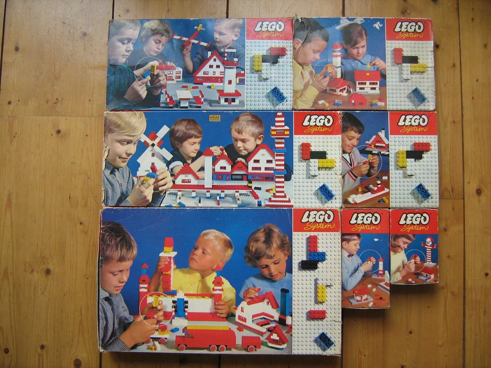
Folio - 1964 Basic Building Sets
Folio is one of those typefaces that you often see but never take notice of. Much in the way of most ‘International Typographic Style’ typefaces, it emphasizes cleanliness, legibility, and objectivity. In this use-case, Folio was used for the set numbers as they were meant to be easy to read but not distracting from the overall box design. The numbers were the information to take notice of, not the style of the numbers.
COURTESY OF FLICKR USER HENK VAN ZANTEN
The boxes seemed to focus on the structure and system of the bricks and what they were capable of creating from such a simple action, highlighted in the circled fingertips. It showcases precision, made true with the recent changes to the brick in 1963 when the material was changed from Cellulose Acetate to the superior ABS plastic.
All this together resulted in an iconic box with bricks on the side and built scenes in the background, seemingly more modern than even future boxes.
As we reach closer to the final lineup, we’ll take a closer look at the first ‘International Standard’ box art.
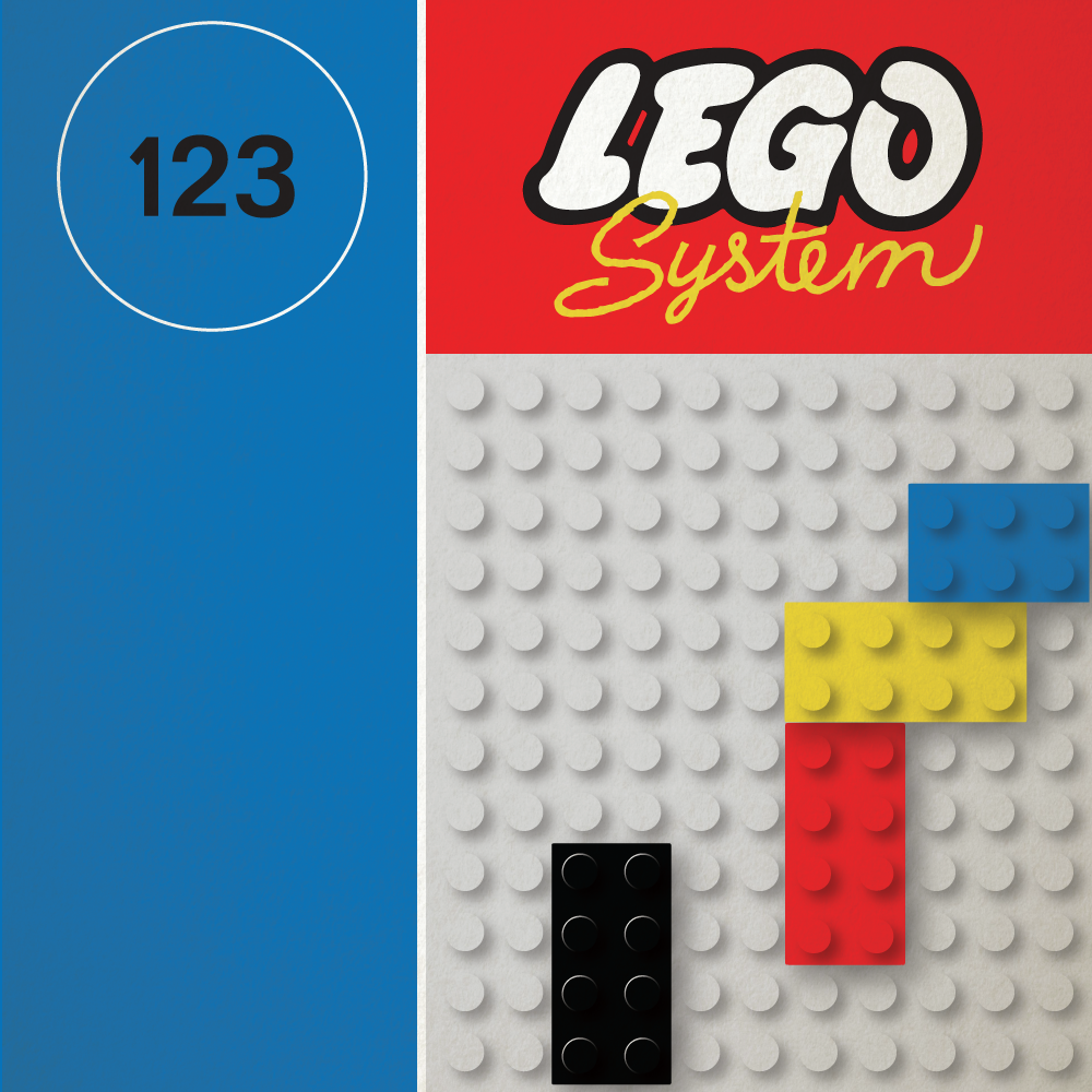
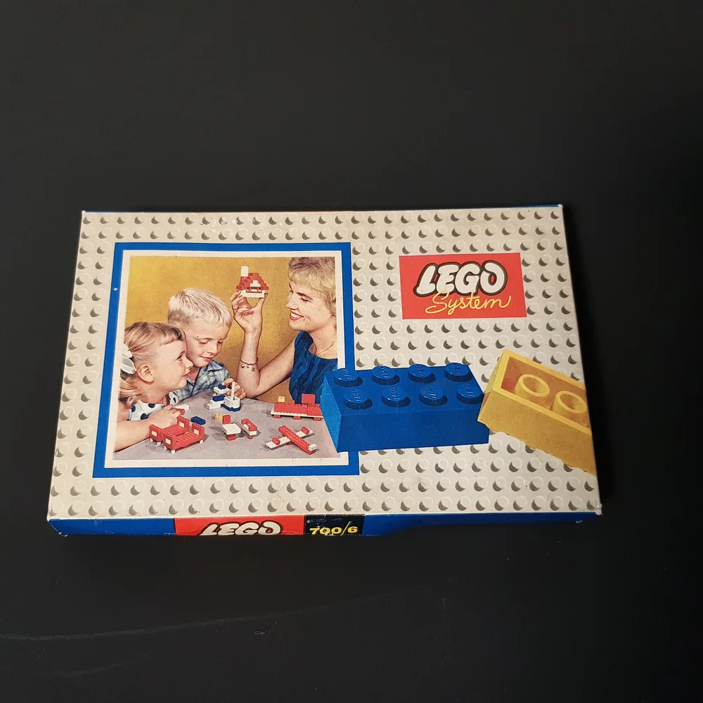
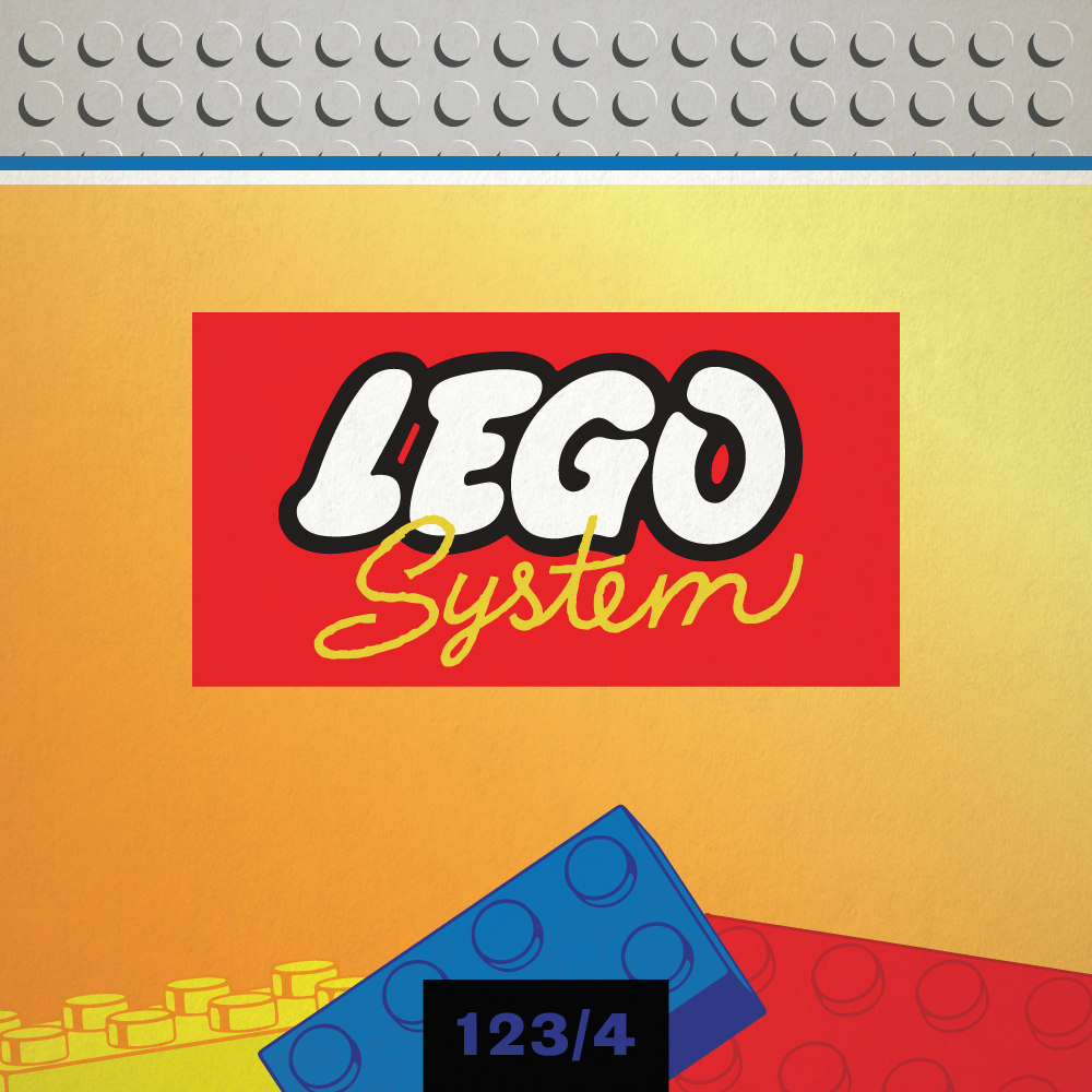
Grotesque - 1960 Town Plan
Goodness, it took me a long time to identify this font! It turns out I didn’t realise how much difference there would be between the metal type used in this print and the digital typeface equivalent. Monotype Grotesque used to be rather popular before being usurped by three other Monotype typefaces seen in this series: Futura, Kabel, and Gill Sans. It’s a great early sans-serif-type example, nonetheless.
COURTESY OF FLICKR USER FABIAN BL
The new logo and box was rolled out worldwide and it was a hit! LEGO was no longer a kids toy on the box. It was a wholesome FAMILY toy. A number of bricks placed in the foreground also cleverly give the customer a bit of an idea on how the bricks might fit together.
The border around the photograph almost gives a sense of the ‘picture perfect family’ that can be achieved when the whole family plays.
This era had such a traditional-looking design, and in my opinion, it is the best box to show someone when they ask what old LEGO was like. To me, this is the definitive “old LEGO look.”
Bonus Round - Theme Logo Rogues Gallery
Before traveling back even further in time, I’ve created a few mockups of some interesting theme badges to showcase the personality that different typefaces can give. Each of them has such a unique voice that set the tone for the theme.
View fullsize
View fullsize

View fullsize

View fullsize

View fullsize

View fullsize

Can you guess which theme all six of these represent?
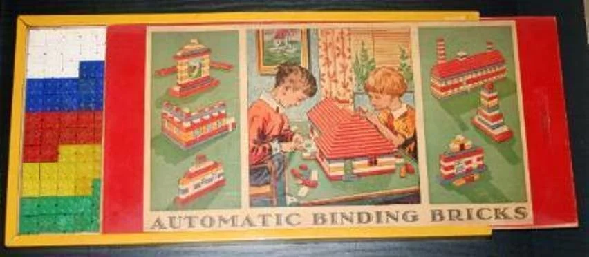
Fatima - 1950 Automatic Binding Bricks
Nothing says luxury and prestige more than the enchanting styles of Art Deco. Fatima, a font designed in 1933 as a glamorous counterpart to a solid version released earlier that decade, looks like the Chrysler Building had kids with an alphabet. The most famous use of it would have to be 2013’s ‘The Great Gatsby’ poster. LEGO clearly wanted an eye-catching upmarket type for its new bricks to set it apart from their wooden toy production.
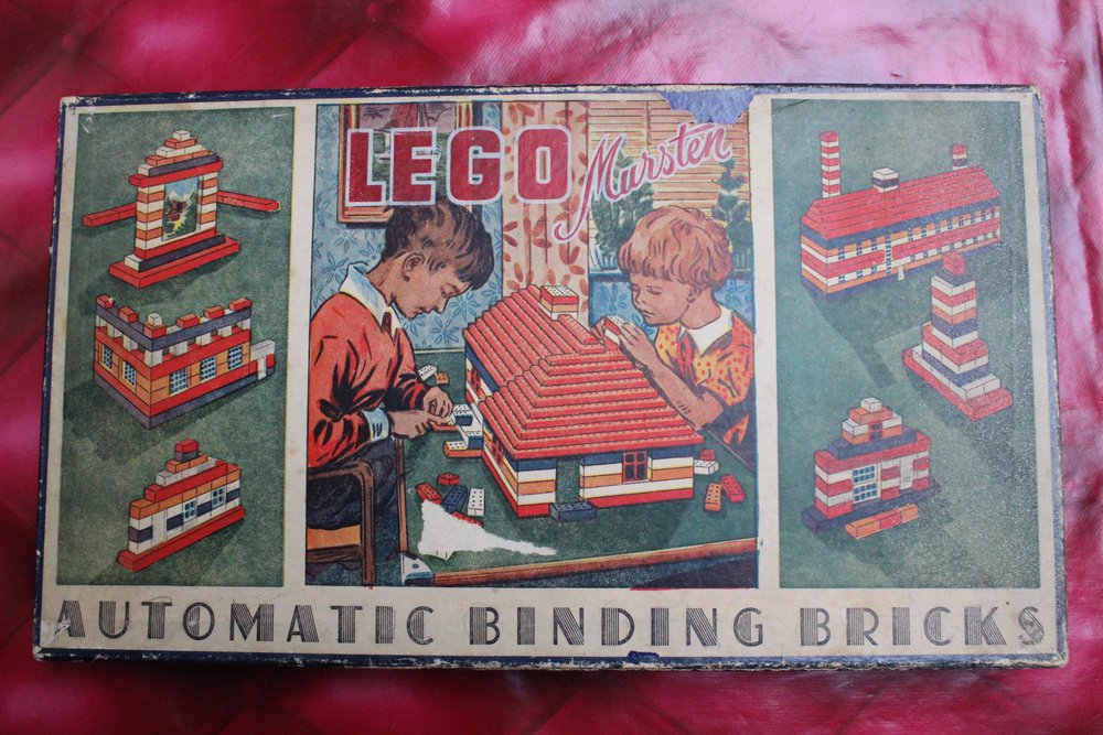
COURTESY OF FLICKR USER BRASLETTY
The box itself isn’t so flashy and is somewhat mismatched with the style of the type, but it still portrays an idyllic notion of life. Kids are playing with their toys in the afternoon sun, not throwing bricks at each other, of course. This box outlays everything the LEGO company wanted it to be: a wholesome family toy, albeit one of prestige.
If you want to use this font, it was redesigned digitally as ‘Atlas’. I love what I believe they were trying to go for with this box, and I’d say they nailed it. It obviously got enough people’s attention to start something big.
Now for the big finale. I’ve scoured the internet and the globe for specimens, prints, and history on the type used for the first LEGO logo. And I finally found my the answer.
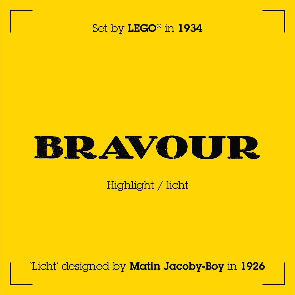
Bravour - 1934 Original Brand Logo
So this is it. This is LEGO’s first attempt to garner the attention of Danish citizens from 1934 onward. We’ve arrived at the beginning of the journey LEGO has taken through time in hopes of creating a lasting connection with its customers.
At the time, the company had a mere six employees, multi-skilled in draughtsmanship, carpentry and book-keeping. Ole Kirk Christiansen and his team were producing simple wooden toys to supplement a struggling furniture and fine carpentry business. What Billund parents wanted was trust in the brand, coming from quality, price, and safety.
COURTESY OF MINILAND.NL
The chosen type to convey this assurance was Bravour. This steadfast typeface was the highlighted entry in the Bravour family. It stood resolute, with a bold, serifed form and striking shapes.
The original LEGO logo was designed in 1926, fourteen years after the original typeface was released in 1912! Ole likely contacted the closest major type foundry D. Stempel AG.
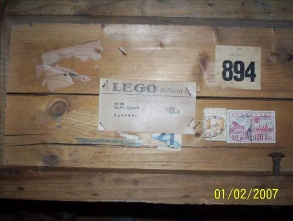
It’s actually quite difficult to track down any physical examples of this type in use as it was mainly for business purposes like the shipping crate pictured and letterheads. Later on, however, it was used on boxes and instructions for Automatic Binding Bricks 20 years after. With this knowledge, I suspect it was simply a set of metal type of which they used those four hallowed letters most often.
THE TYPEFACE HAD EVEN BEEN USED ON OBSCURE AUTOMATIC BINDING BRICK BOXES! COURTESY OF GARY ISTOK.
A SAMPLE OF THE ORIGINAL VERSION OF THE TYPEFACE COURTESY OF Letter Library
For the final entry, I wanted to do something special. I wanted to go for accuracy in the execution. This typeface proved easy to find copies of, but difficult to find the original. The digitized modern fonts also don’t follow the original forms of this typeface. Of course, in the only way I know how, I ended up finding every specimen on the internet of this typeface, the original and its derivatives, and created my own glyphs instead!
I contacted three letterpress and print-making facilities around the world to get some more information on the type and its availability. I found it was one of the rarest to come by from that foundry, so I knew procuring my own metal type would come at a significant cost. I didn’t want to let that stop me as usual!
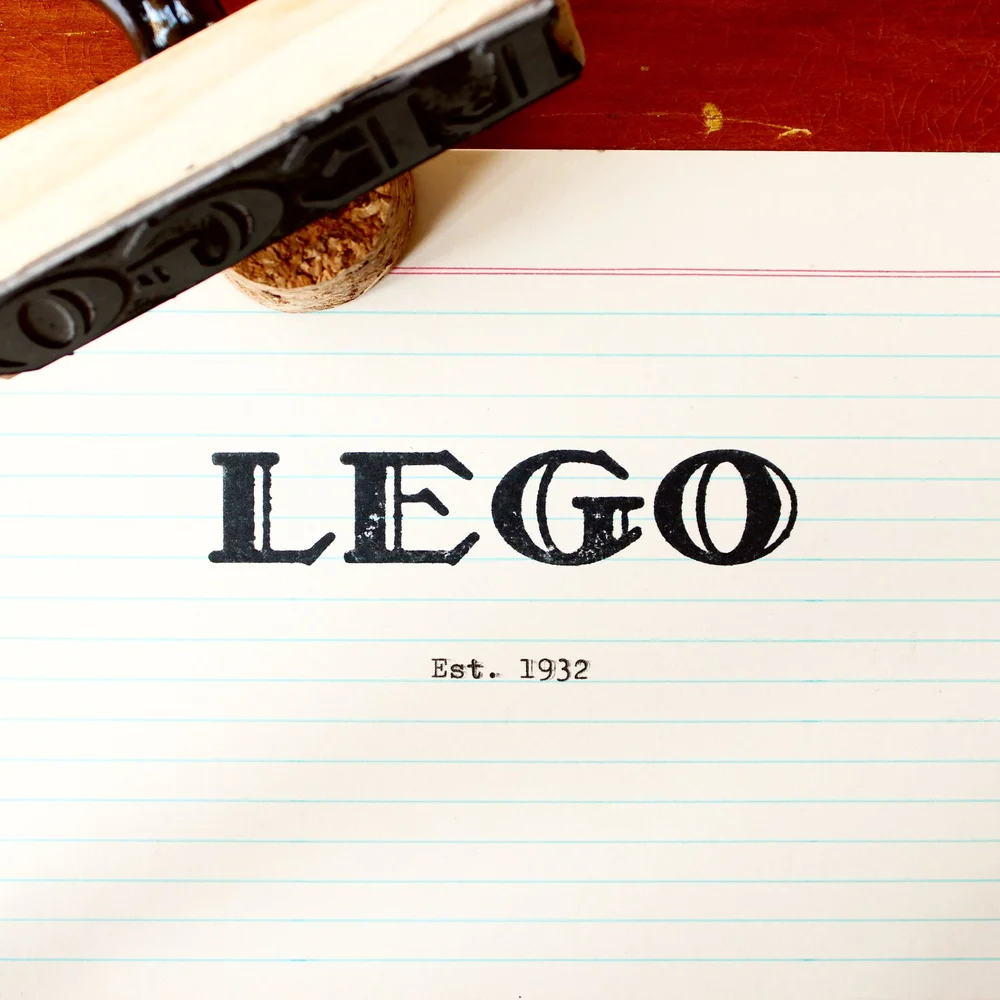
In the end, with the hi-res vectors of these four glyphs based on original 30s and 40s specimens, I got a pine-backed traditional rubber stamp produced in exactly 72pt size. In a way, the stamp was a fitting, tactile end to this series, bringing it back to basics. I’m not certain LEGO had ever considered a task like this, so perhaps this is a revelation for the community and for the company which I’m a little proud of.
Fonts All, Folks
Thank you, one and all, for coming on this typography journey with me. I don’t know what I set out to accomplish when I started this project so many years ago, but I hope that I have sparked curiosity in those who want to have a deeper interest in these matters. A lot of this design work often goes unnoticed as part of a larger whole, but the effort that a team at LEGO formed in the 30s collectively poured into the following 90 years of packaging and marketing is important and should be remembered.
Did you discover all the themes the fonts represent in the gallery above? Let us know in the comments below.
Do you want to help BrickNerd continue publishing articles like this one? Become a top patron like Charlie Stephens, Marc & Liz Puleo, Paige Mueller, Rob Klingberg from Brickstuff, John & Joshua Hanlon from Beyond the Brick, Megan Lum, Andy Price, Lukas Kurth from StoneWars, Wayne Tyler, LeAnna Taylor, Monica Innis, Dan Church, and Roxanne Baxter to show your support, get early access, exclusive swag and more.