Skillful Habitats: The Five Keys To Building Small
One of my early entry points into MOC building was joining the Disney Habitat Challenge on Instagram in 2022. It was my first Instagram challenge, and it got me hooked on the benefits of habitats (and joining challenges for that matter).
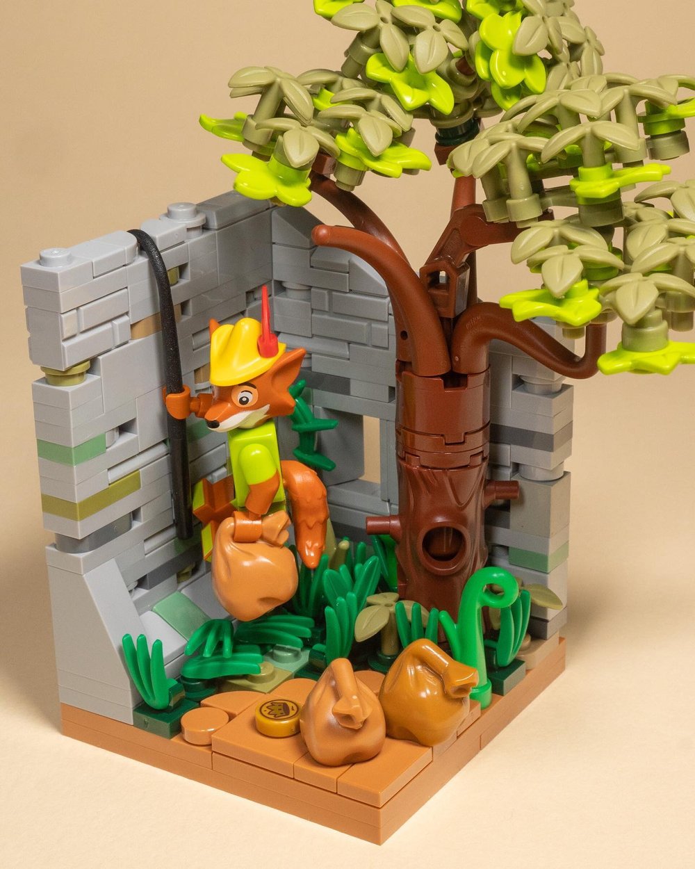
Disney Robinhood habitat by @Brickbuiltjosh
Their small size is a welcome challenge while being super manageable to create, even when life was turned upside down as happened last year. They seem small and innocuous, but they can pack a ton if you approach it with curiosity and an eye for detail.
Habitats are the haiku of LEGO building: easy to dismiss, but you can fit worlds inside its small structure. We’ll explore exactly how you can make the most out of those 8x8 stud haikus with five key skill areas that are guaranteed to elevate your build’s impact.
If you’re new to building your own creations or are hesitating to start as you wait for the perfect inspiration or idea… habitat building is ideal for getting started. I loved them for being able to try a lot of different things quickly and experiment with techniques for detail.
Habitats are all the more powerful for skill-building because they are so small and constrained. And that’s where this article comes in. Because when you have no more than an 8x8 stud base to work on, you have to be ruthless. There’s no margin for sloppiness. Your eye and skill for detail gets honed quickly. And if you think it has to be just a corner of a room… think again.
What’s a Habitat?
What I’m primarily referring to are “minifigure habitats” that are 8x8 studs square and a little over 8 bricks high. Other formats have been done, including expanding it to 12x12 or larger, doing habitats for Brickheadz style figures or miniland style figures, and more. And like all things, you can get super strict or stay a little looser with the requirements.
The undisputed queen of habitat challenges is Jen of BrickFamBuilds. And the biggest one of the year is always the Disney Habitat Challenge she started with TrickyBricks. That is the one that pulled me in and is still my favorite of the year. Jen’s approach is that as long as you are using an 8x8 base, you can get creative with how you challenge the format. That includes the height, having overhang, having walls or no walls, and the back can be as messy and ugly as you like.
But here’s the core structure she teaches that will allow them to dependably stack and interlock together:
1: Start with an 8x8 plate, or combination of plates, as your base.
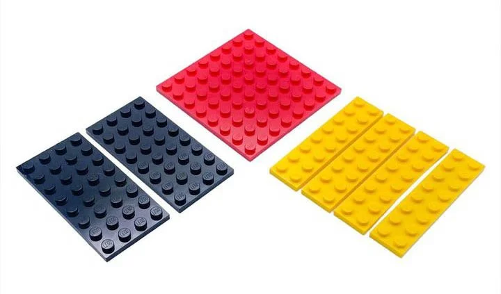
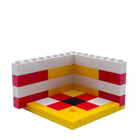
2: The walls start with 4 bricks high with the left side overhanging the edge by 1 stud. Then you go another 4 bricks higher with the overhang now being on the right. With a total of 8 bricks high with a tile on top and a couple studs (for stacking habitats on top of each other). The overhang on each side is how the habitats interlock with each other.
The black cheese slope in the final example is only to cover the exposed stud if you don’t have an interlocking habitat connected there.
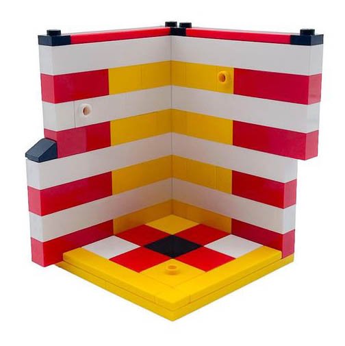
3: Use a minifigure to build an environment and story around it. The walls and floor can be built any way you like. The back can be as messy as you like. No one sees it normally, but it’s a common thing for people to show off their messy backs as the last image of their post in the Instagram challenges.
This particular format allows the habitats to all stack together, including stacking with anybody else’s habitat. I’m not going to get into habitat stacks in this article (stay tuned for that one). But that is a whole next level of creativity and story-building to add to your habitat building journey. Here’s a typical example of how habitats stack using the standard format. Notice how the overhang interlocks with each other.
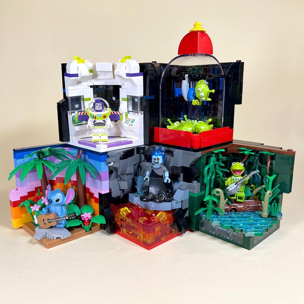
My first habitat stack for the Disney Habitat Challenge in 2022.
Building Skillful Habitats
Now that you have the basics of the structure, it’s time to play! Habitats don’t have many rules beyond the 8x8 format, but that one rule really restrains you. As the haiku of LEGO building, every detail counts.
So, to help you in this venture, we’ll go over five key elements of design, technique, and habitat-building secrets that will make you a more skillful habitat builder. Like all art, it’s all about seeing and detail, color and composition.
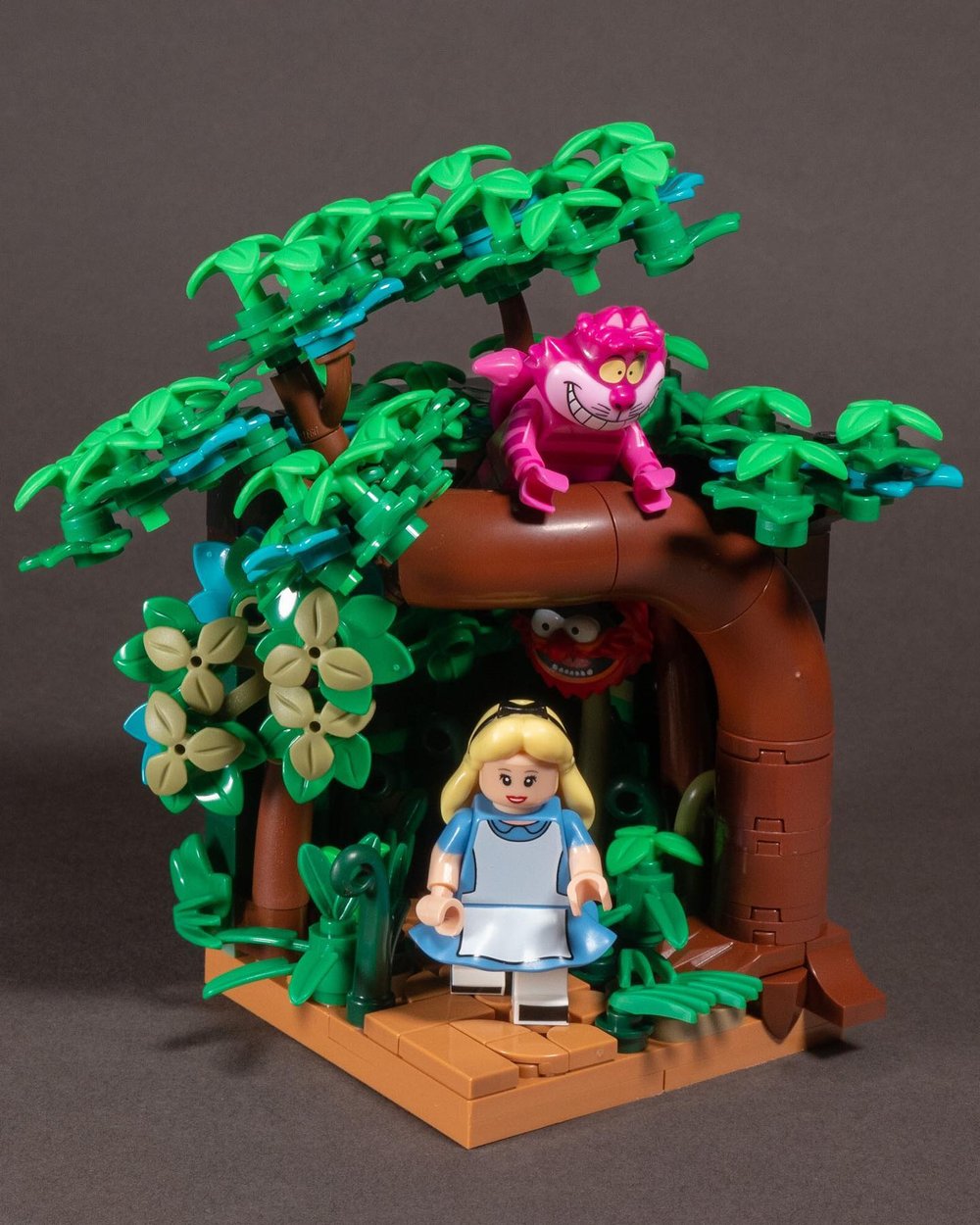
My Alice in Wonderland habitat shows that even while sticking faithfully to the 8x8 base and two walls that can stack, there’s a ton you can pack in!
These five keys to better habitat builds are not rules but opportunities. You choose which to employ and how you’ll use them. But by bringing more of these into your habitat-building repertoire, you’ll improve the outcome.
Color: Use a Limited Palette of Dominant Colors
Everything is heightened in a small creation like this, and that especially goes for visual “busyness.” The more you can hone your color palette, the easier it will be to create a striking creation that is also clear and compelling.
The extreme of this is monochrome habitats. They’ve been around for a while, and no one can deny what they lack in color variation, they more than make up for in striking simplicity and visual impact. Such asthis stack by Dana Knudson (troublesbricking).
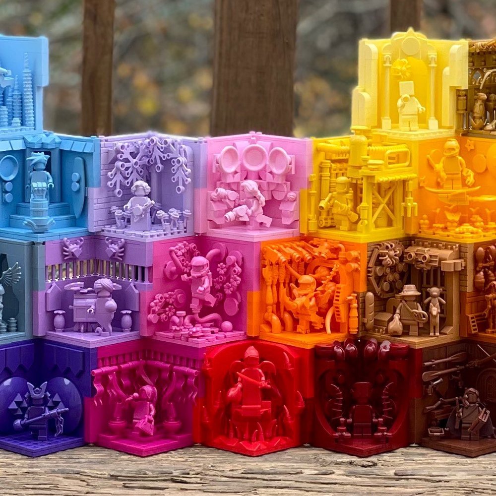
When it comes to monochrome, it becomes all about shadow and texture. And sometimes contemplating the sacrifice of removing prints from $30 LEGO camels…such as the monochrome habitats of Caz Mockett
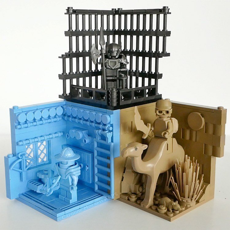
If that’s too minimalist for you, stick to a complimentary combo of 2-3 key colors that dominate the color scheme.
Depending on your type of build, you can have subtle variations of those key colors to help add depth and texture, such as using gray with bits of sand green or sand blue for stone walls. Or using variations of the same color - such as tan, nougat, dark tan, pearl gold, etc. to add a little texture and depth without introducing entirely new colors to your palette.
One little exception to the 2-3 color rule:
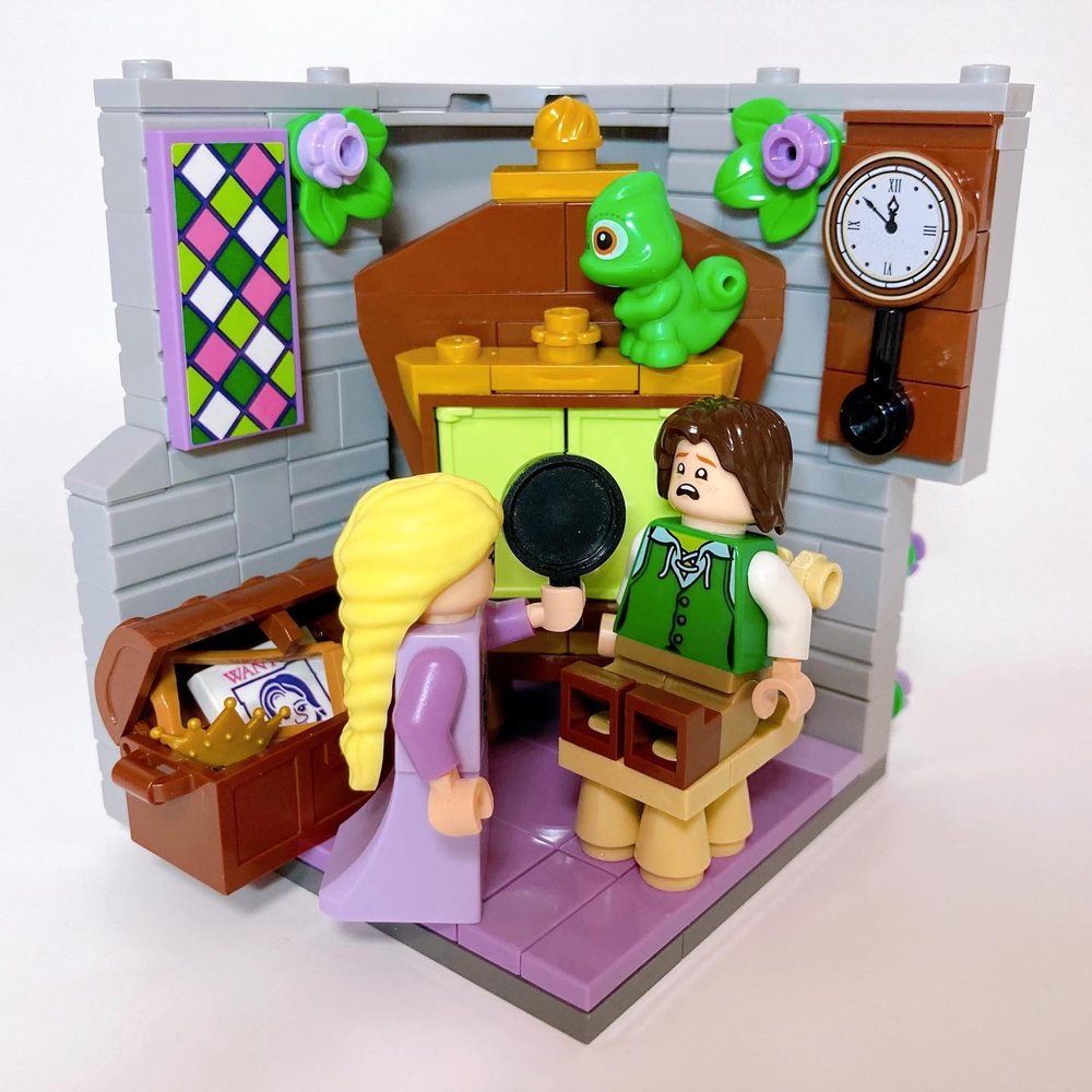
You can cheat a little, and add in a dominant use of grey, black, or white outside your 2-3 dominant colors as they are neutral tones and can even help to tone down a color scheme. They don’t compete with other colors in the composition. So the grey background with the earthy tones (brown/gold) and a pop of lavender and green in this Tangled scene by lego_nano_1 still works without appearing overly busy. The grey actually helps tone down and ground the overall look despite the other bright colors.
Can’t decide what color combination to use? Try using Design Seeds as inspiration. Either scroll through their sample palettes or choose a starting color in the left sidebar. It’s not an exact match for the limited LEGO color selection, but can get you some good ideas!
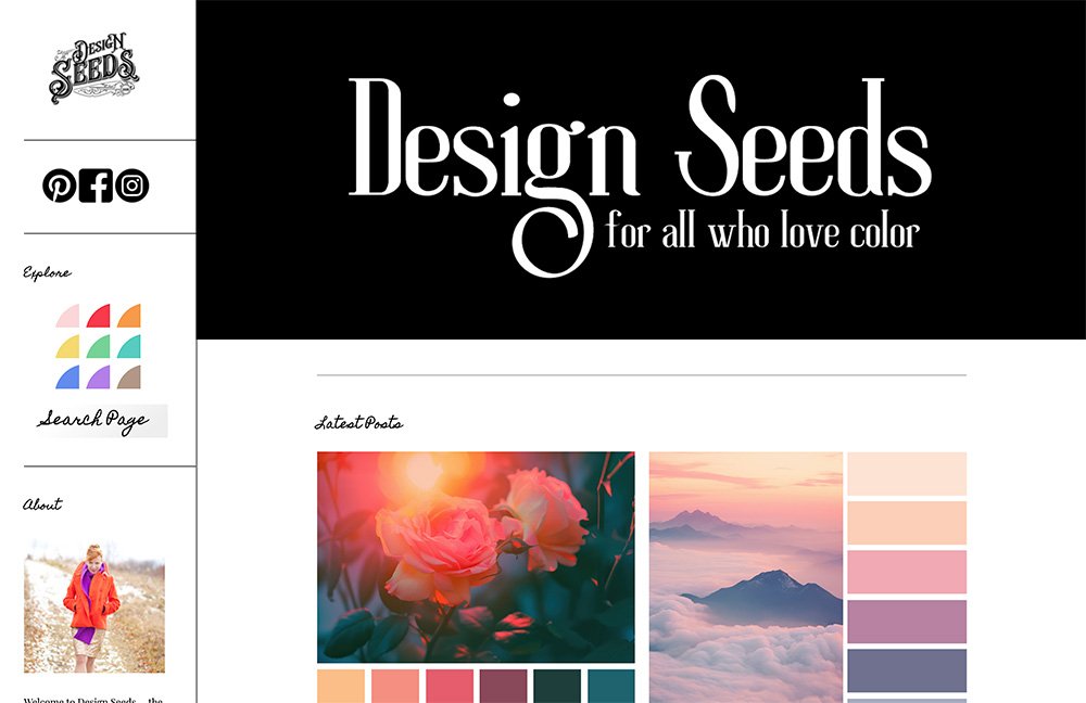
One thing worth noting as you scroll through Design Seeds is that there are typically six swatches for each palette… BUT there are still only 2, maybe 3, dominant colors. The rest are variations on those 2-3 dominant colors to add depth and shade, and to show how it’s often better to have one of those colors be more dominant than others.
You can apply the same approach to your palette. Choose 2-3 dominant colors but you can use some different shades or variations of those dominant colors to add interest and depth. You can also check out this recent BrickNerd article on color theory to go a little deeper into the topic!
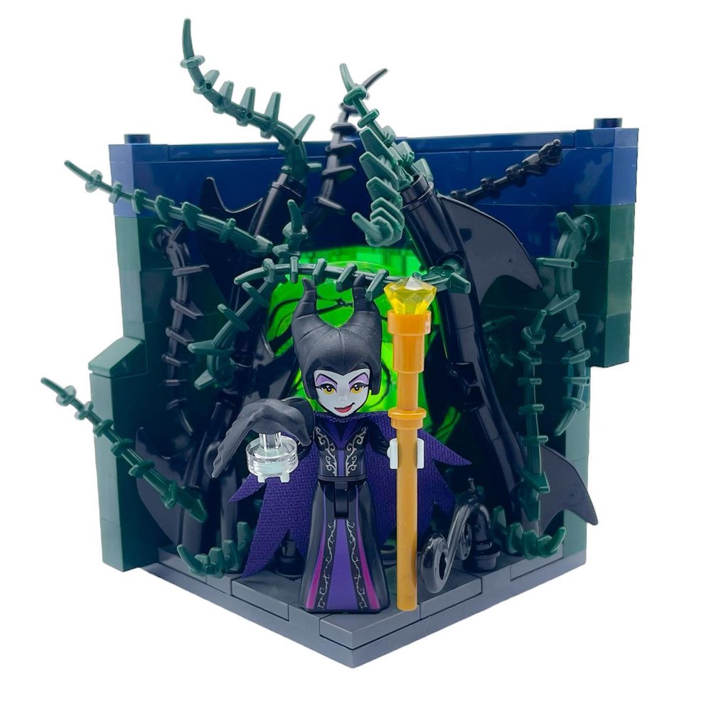
How does this work in practice? Let’s take a look at this otherwise very busy background for Maleficent by Jen herself (BrickFamBuilds). If we kind of blur our eyes a bit, there are really only three dominant colors - black, purple, and bright glowing green. The earth green, dark bluish gray, and dark blue meld with the blacks. This helps make the otherwise busy thorny bramble read as a more cohesive color block, allowing the bright green and the subtle purple accents to pop out and highlight the character and the story.
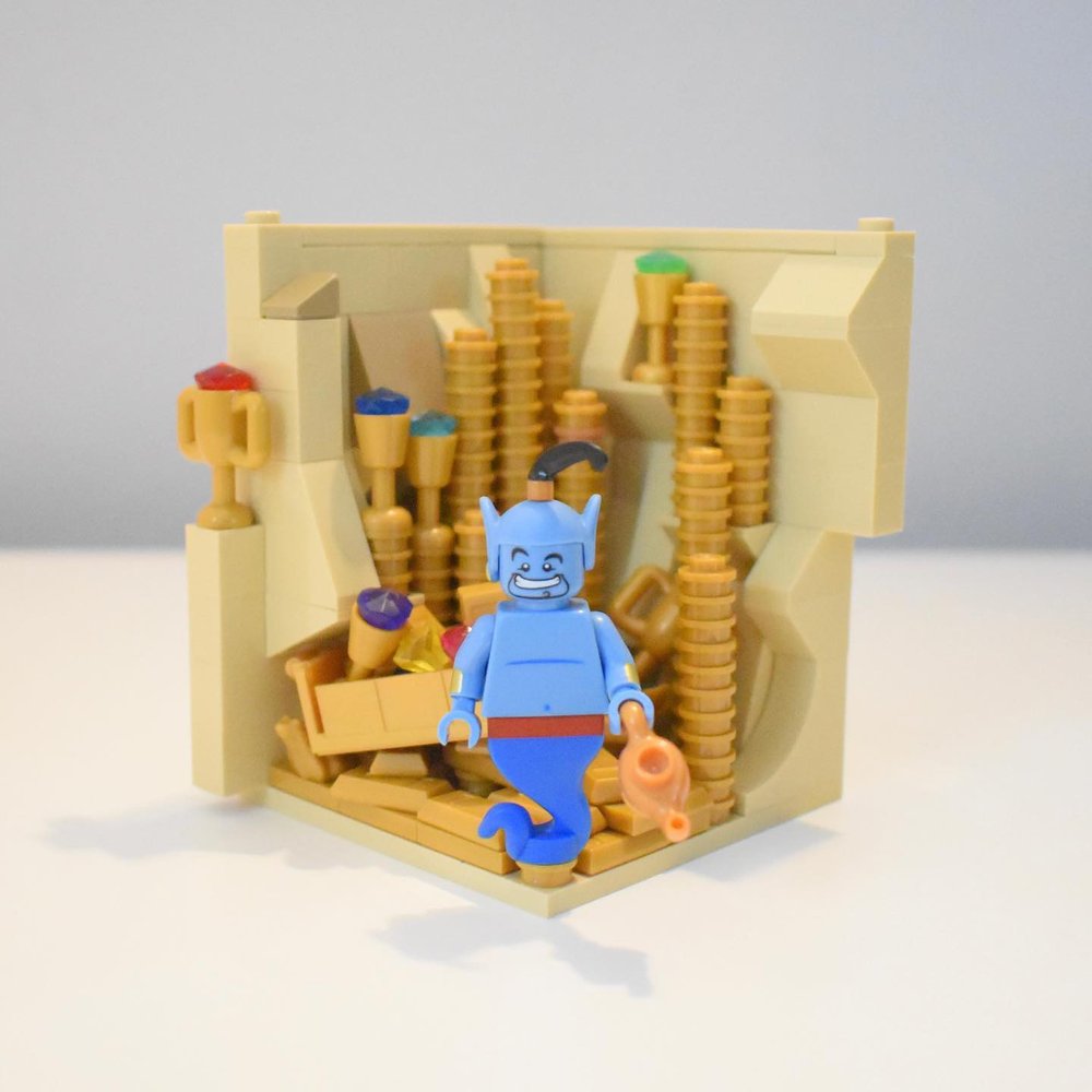
In this clear build by Thomas (minimalbricks) you can see how the tans and golds keep a clean background to make the blue Genie visually grab attention while still having clear story references.
Focus: Keep it Simple, AFOL
Next up is composition. Keep it simple. Clean lines. Clear shapes. Allow a central focus that is undistracted, particularly when it comes to the minifigure at the center of the story. The easiest way to kill a composition is to pack it with stuff all vying for attention instead of having a clear focus and clean shapes. You’ll hear this often on LEGO Masters from Amy and Jamie.
Choose your focus. And keep most of the scene undistracting from what is important to communicate the core theme or the story of the minifigure. Keep it simple and focus on making what is in the scene refined and clear.
Simplicity can come in many other ways, too. Such as simplicity in color we already discussed. Matticus Bricks here shows a couple of examples of sticking to clear palettes of 2-3 colors and simplicity in blocking color areas together and clean lines and shapes. While still having good finer details so as not to look “simplistic.”
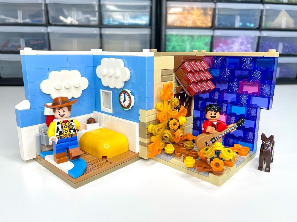
For Woody’s habitat, he has some neutral white and nougat with dominant colors of blue and yellow, with the blue and yellow both complementing the minifigure’s own use of the color scheme. It’s all kept in clean simple blocks of color. The Coco build has more variation, but still within clear blocks of color with the purple sky, red shirt/roof, and earthy tans, yellows, and dark orange blending together in another block of color.
The simplicity of both scenes allows for clear, striking compositions while allowing the minifigure to stand out with a clear focus.
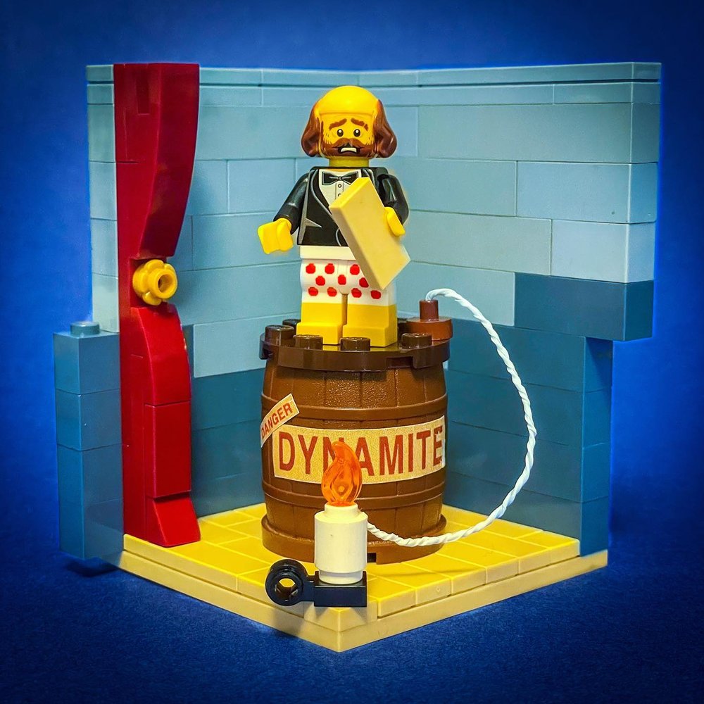
Let’s look at some other examples of clean, clear simplicity. Like this Haunted Mansion reference to the stretching room portraits, created by TrickyBricks. Clean and clear with fine detail where it counts to make the figure and the story stand out.
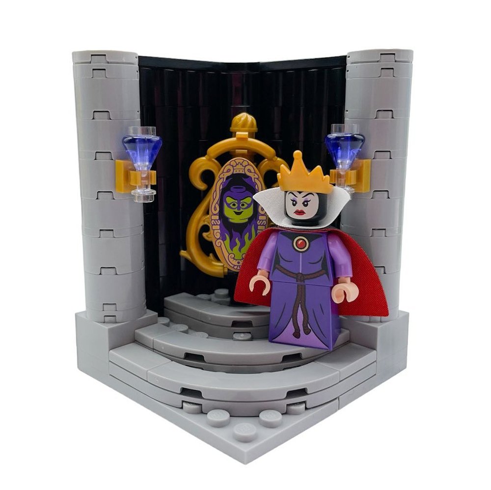
Again, a good example in both color and shape with this one by Jen. The 2-3 color palette with purple, gold, and neutral grey/black. The clear and bold shapes with clean color blocking, allow the mirror and the character to stand out for a clear focus.
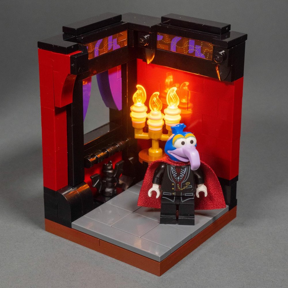
Another example is my Muppet Monster Mashup Mansion habitat for Gonzo Dracula here. Clean, clear, and targeted use of detail without distracting from the minifigure as the focus.
Texture: Bring on the Detail (and Itty Bitty Parts)
With an 8x8 footprint, every single stud counts. The tiniest of LEGO parts are gold. Minifigure accessories become epic touches. Keep it simple still applies, but there are ways to bring tons of detail in while keeping it visually simple and clear. And you want to bring in detail because detail adds depth. Visual depth creates a richer feel and often supports the story of the minifigure you’re trying to convey.
As we get into how to do this, first consider this fact: One 1x2 brick placed in a habitat takes up 25% of the width, and 12.5% of the height of your entire habitat in one fell swoop.
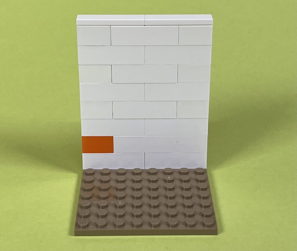
That’s a big impact. That’s like using a 6” wide brush you’d use to paint your home to do a fine art painting. Or building a video game character in old-school NES 8-bit graphics. That can have its place. Like when leveraging simplicity in your composition such as having clean blocks of color.
However, I recommend having plenty of plates and other smaller parts at your disposal to strategically add detail. Along with parts that have a lot of extra little detail or unique shapes, such as minifigure accessories. And let's not forget printed/stickered tiles! Lots of creative uses for those to add fine detail to the scene.
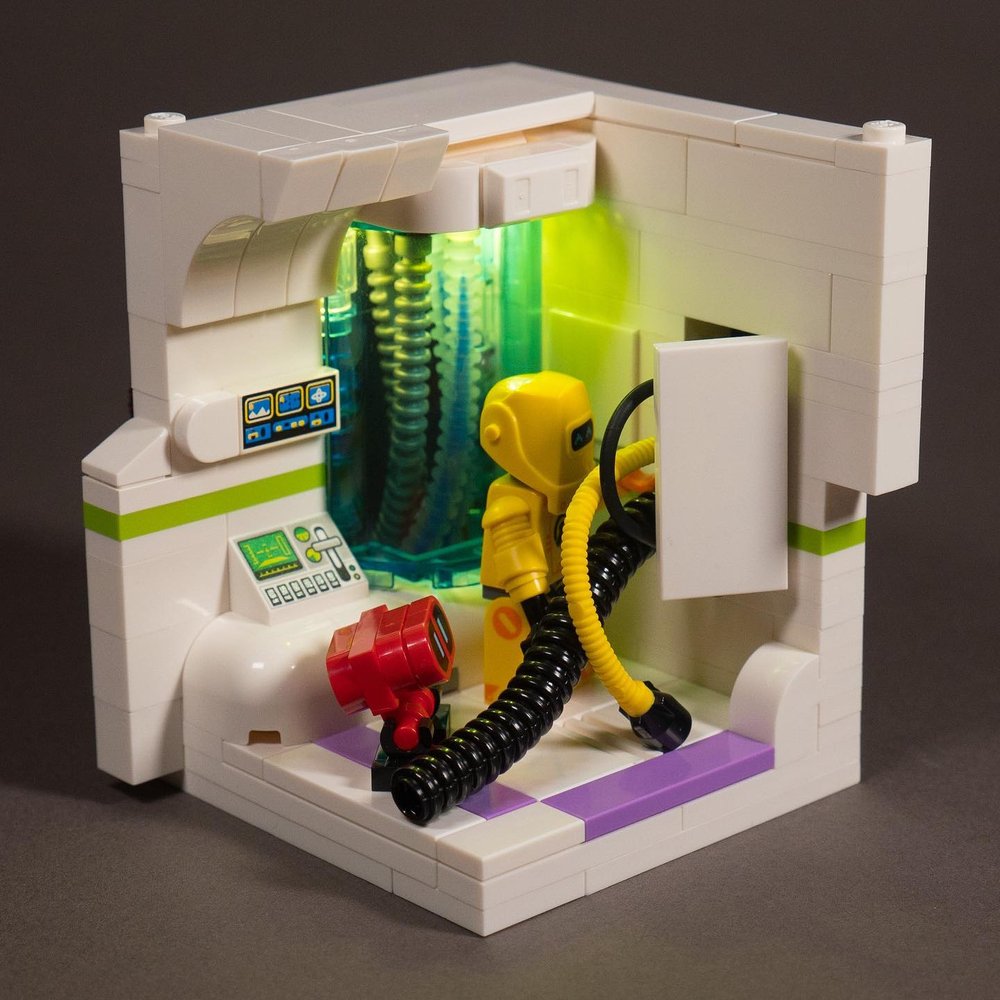
My CMF robot habitat uses a lot of white brick but also plenty of curved pieces, plates to add a touch of color, ingots and ridged hoses for texture, some printed tiles/slopes, all to add texture and detail without overwhelming the scene or losing the clean, white sci-fi aesthetic. You’ll even notice subtle detail like the tile in the right wall that is inset half a plate deep (using a bracket) to add a subtle panel.
Now, let’s say you’re building a stone wall. You could use 1x2 bricks. But let’s take it up a level of detail. You could use some 1x2 masonry bricks that have the brickwork pattern in them to add finer detail. Good, we’re increasing the fidelity a bit in an otherwise solid color wall.
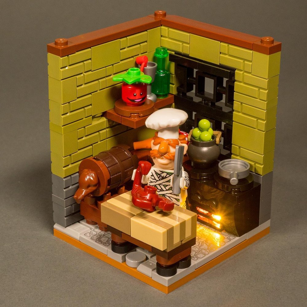
As part of my Muppet x classic movie monster mashup series - The Swedish Chef as the mummy. By BrickBuiltJosh
Then let’s go even further. Let’s forgo a lot of the bricks, and start using plates, with a masonry brick in there once in a while. We can use slightly different shades/colors with 1x2 and 1x1 plates, use some 1x2 and 1x1 rounded plates, and even sprinkle in some 1x1 quarter tiles or cheese wedges. Maybe use some SNOT bricks to add some extra details sideways. The ingot piece is another part that has interesting shapes and angles in a small space.
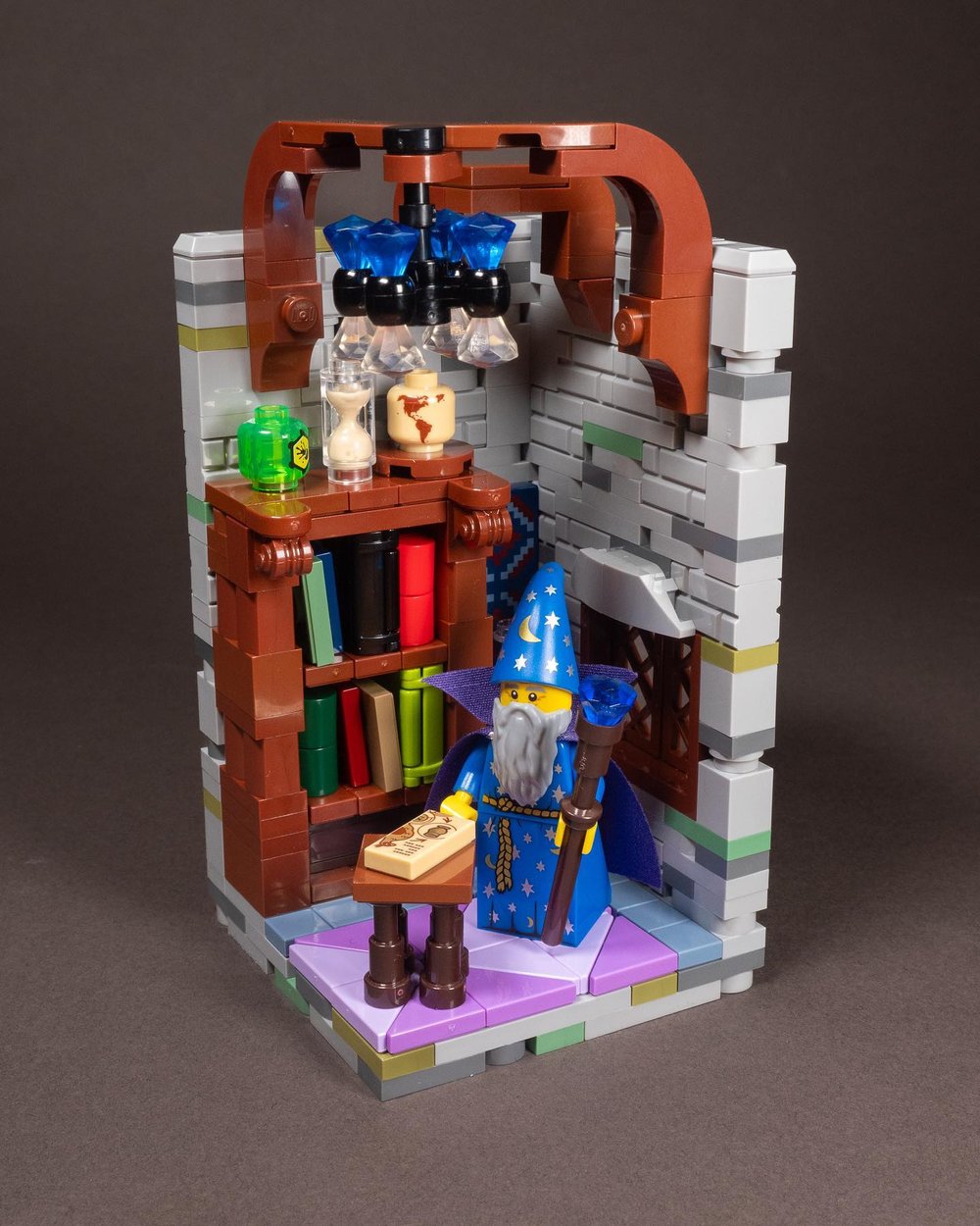
The Wizard’s Tower habitat by BrickBuiltJosh. This is taller than standard, and intended to be the top of a habitat stack
As long as you stick to your core color palette (and slight variances), you can add tons of detail without it becoming too visually busy that it loses clarity and focus in the overall composition. That detail adds depth and character.
Now let’s expand from the walls, and look at everything else in the scene. How about the furniture? How about bottles, books, tools, lamps, paintings, floor patterns… all the things that help tell the story of your minifigure or the scene you’re trying to convey. How detailed can you make these things? How small can you make them to fit the scene?
Composition: Clump and Contrast
Depth comes from detail, but lots of detail can easily make for an overly busy scene. A focused color palette helps. But there’s another key visual skill that can help bring everything together into a visually clear and dynamic composition. This skill is to clump and contrast.
They work together to create a more dynamic and visually balanced composition. They also make it so you can harness detail without the habitat becoming a complete mess that confuses the eye and makes it hard to have a clear focus and an overall striking design.
Particularly when it comes to taming detail, clumping is your friend here. For example, foliage is inherently messy with lots of leaves, maybe some flowers, and just a lot of stuff packed together with lots of angles and shapes. But if we clump it together in particular areas instead of evenly distributing it everywhere, we bring some visual order to the chaos.
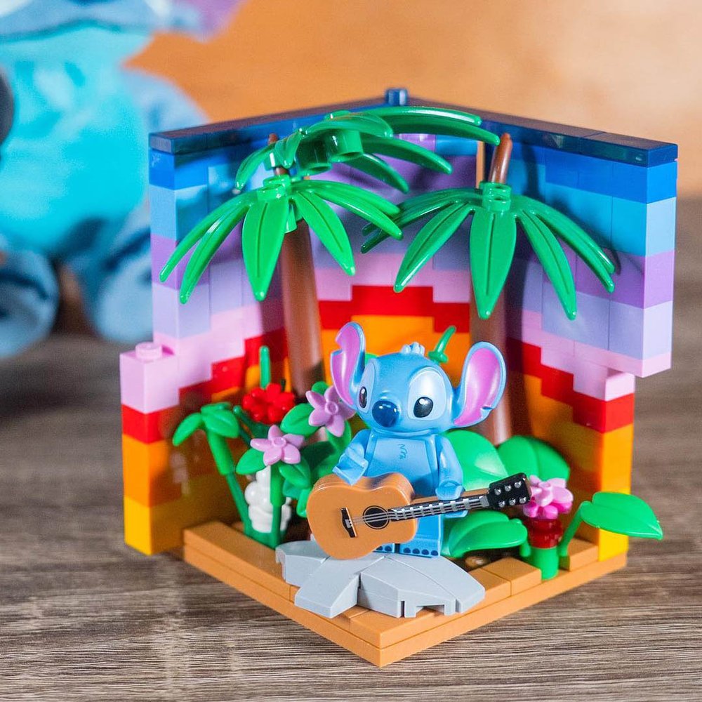
In my first habitat, the foliage adds a lot of chaos to Stitch’s outdoor scene, especially considering the added colors of the sunset behind it, adding a lot of color variation. By clumping the foliage in one area of the habitat, and the tree foliage up above in another distinct clump, it helps tame the chaos. And the pinks in the flowers echo the color of Stitch’s ears. With all the colors and all the detail, this could easily descend into visual chaos. But the clumping helps organize it just enough to still be clear and effective.
This goes for other things as well. For example, a bookcase filled with different colored books is inherently a lot of chaos in color. However, it’s clumped naturally by the bookcase containing them. And more so by making the bookcase only a portion of the habitat (like the wizard habitat above), and not the entire space. This clumps it down into a portion of the visual field, keeping it a cohesive area instead of scattered everywhere.
Same with a wizard or witch’s potions or arcana, a mad scientist’s laboratory equipment, or stuff pinned to a wall. By constricting it to different-sized clumps, we’re visually organizing it in a way that makes it easier for our eyes to read the scene. Such as this beautifully organized habitat by 3d_soup full of detail that uses clumping and sticking to a dominant color palette and neutral colors to bring visual order to it all.
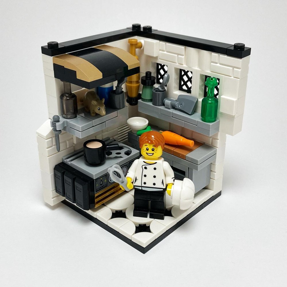
Clumps also create a distinct visual feature. Achieving the same effect as a block of color, a door, the shape of a piece of furniture, or the minifigure itself would, despite being a lot of elements. An artist's trick is to look at it and blur your eyes. When blurred, can you see the dominant shapes and colors? Or does it turn into a bland flat blur? Do any features stand out at all?
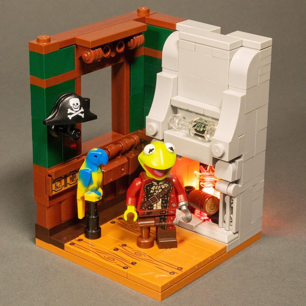
There’s a lot of detail in different areas of this scene (another in my Muppets Monster Mashup Mansion series with undead pirate Kermit this time). Detail is constricted into specific areas. Other areas are cleaner with less detail and more solid color to let the overall composition breathe. This helps to avoid the details from overwhelm the design.
The detail is within blocks of color, so using the blur test there are distinct shapes easily discernible to bring visual order to the composition.
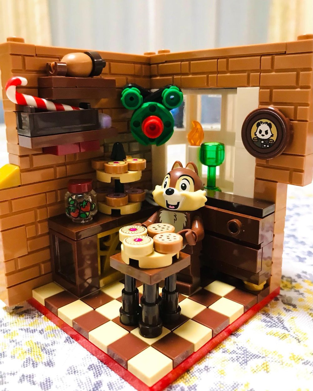
Another example of clumping in what could be an overwhelmingly busy habitat is this one of Chip during the holidays by vanilla.lego. This builder could have scattered the details everywhere randomly. But instead, there are distinct bunches of detail. The floor even has a pattern that harmonizes with the dominant color palette of the habitat, and the solid color wall helps tone down the busy-ness of the checkered floor by keeping the busy pattern in a specific area of the overall design.
But it’s not just about clumping. Contrast is the other critical side of this particular composition skill.
Contrast is critical to create a dynamic visual look, and to have key elements stand out, like your minifigure. It creates more clarity, more interest, and guides attention. Contrast in shape, color, and texture all contribute, and can also help tame the chaos of a highly detailed scene. Contrast only works when you’re following the other skill areas including clumping. Because contrast in chaos just makes it more chaotic looking. Like static on an old TV.
Let’s take this example of Kermit in the swamp. This was part of my first Disney habitat challenge, which I accidentally crumbled to pieces 20 minutes before I had to have photos ready and posted for the challenge deadline!
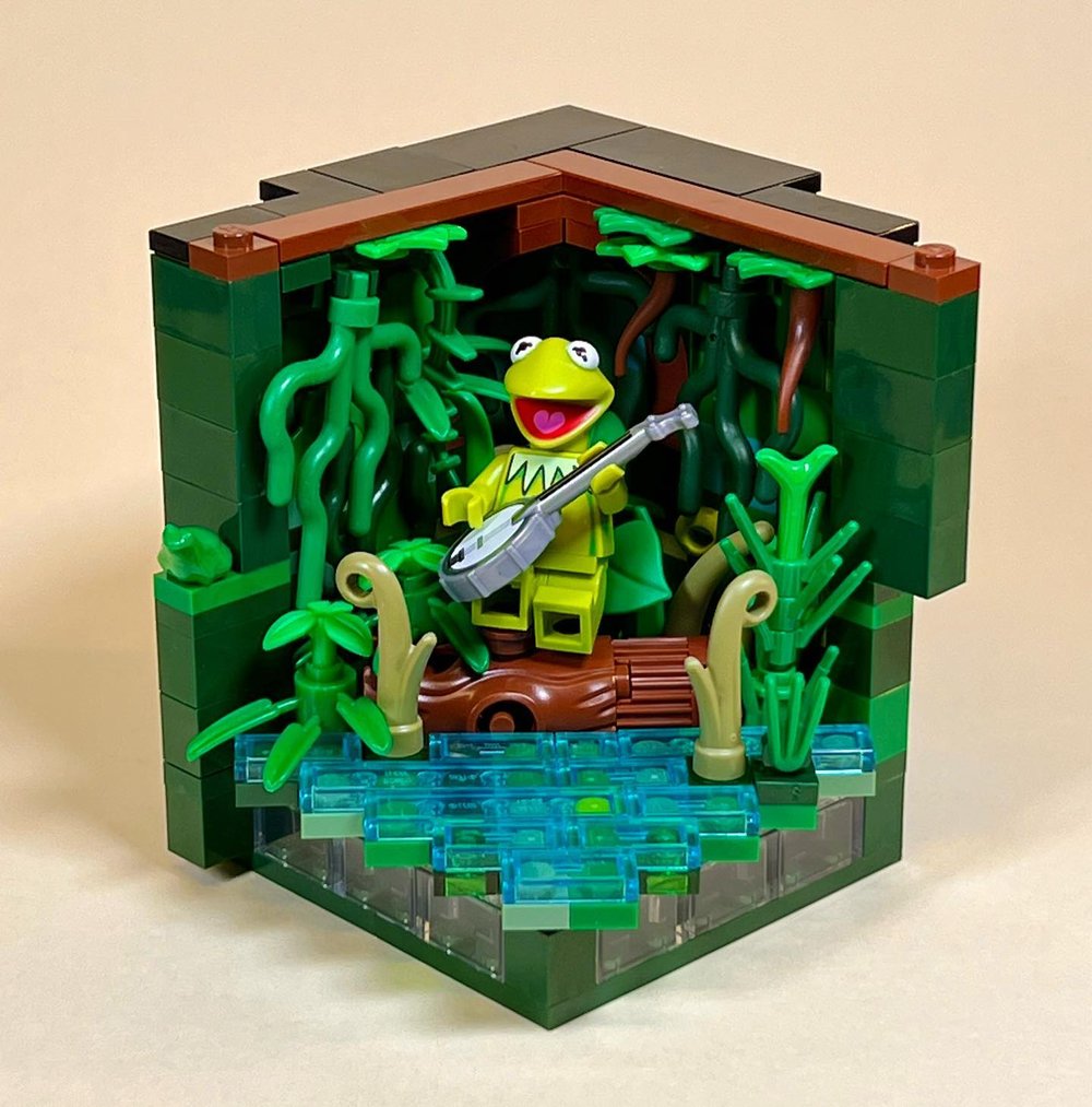
The foliage and scenery could have made for a very messy composition with no real focus. Particularly since Kermit, being green himself, could have been completely lost in the background. To avoid that, we use the various visual skills we’ve gone over. We use clumping of the foliage, clean areas of color like the swamp surface, sticking to a three-color dominant color scheme with blue, green, and accents of brown, and have the background blend into a detailed but cohesive block of color.
And then to keep Kermit from being lost, we use contrast to a subtle but critical effect. By sticking to regular green and dark green in everything besides Kermit, we allow Kermit’s brighter, yellower lime green to still stand out. By not using any lime or spring yellowish green in the background (and limited bright green even) we create a color contrast for Kermit.
Contrast can happen in a lot of ways. Clumping uses contrast between texture areas and smooth areas. The color palette uses contrast between blocks of color to define the composition. Light and dark can be used strategically to create contrast like the earlier example of Malificent in front of the very bright green that is shining through the very dark brambles.
This example from Catrin Johnson (simplelovelyuseful) uses the contrast of smooth and textured areas. She also uses the contrast of the bright lizard and Starlord’s head to bring attention to the key story point recreating the scene from the movie where he grabs one of the weird creatures and uses it like a microphone.
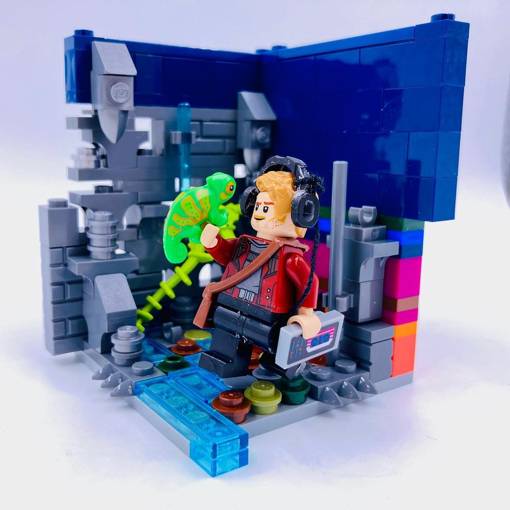
If you go back through the examples, you’ll find plenty of examples where contrast is used in a variety ways, including color, texture, light/dark, size contrast, and more. However you use it, contrast creates dynamism in a composition that can guide the eye and grab attention.
Story: Harness a Moment
One simple way to elevate a habitat, no matter your skill level in building, design, or details, is the story. Rather than just having a character in an environment that suits it, try focusing on a moment of storytelling.
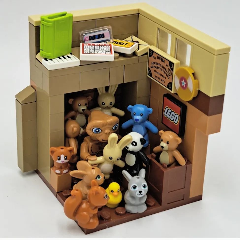
The iconic moment in the E.T. habitat by Anabelle (brickswhynot) isn’t hard to recognize, and it brings out the story to full effect. It also uses good application of color palette, simplicity, clumping, etc. to give a good visual composition despite being packed with detail. There are several ways you can heighten the storytelling in your habitat very easily.
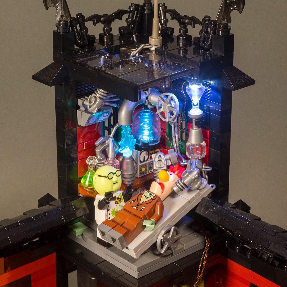
Beaker and Professor Honeydew as Frankenstein and his monster, but BrickBuiltJosh
Have the character doing something. Running, screaming, mixing potions, climbing, or reanimating dead flesh with electricity…
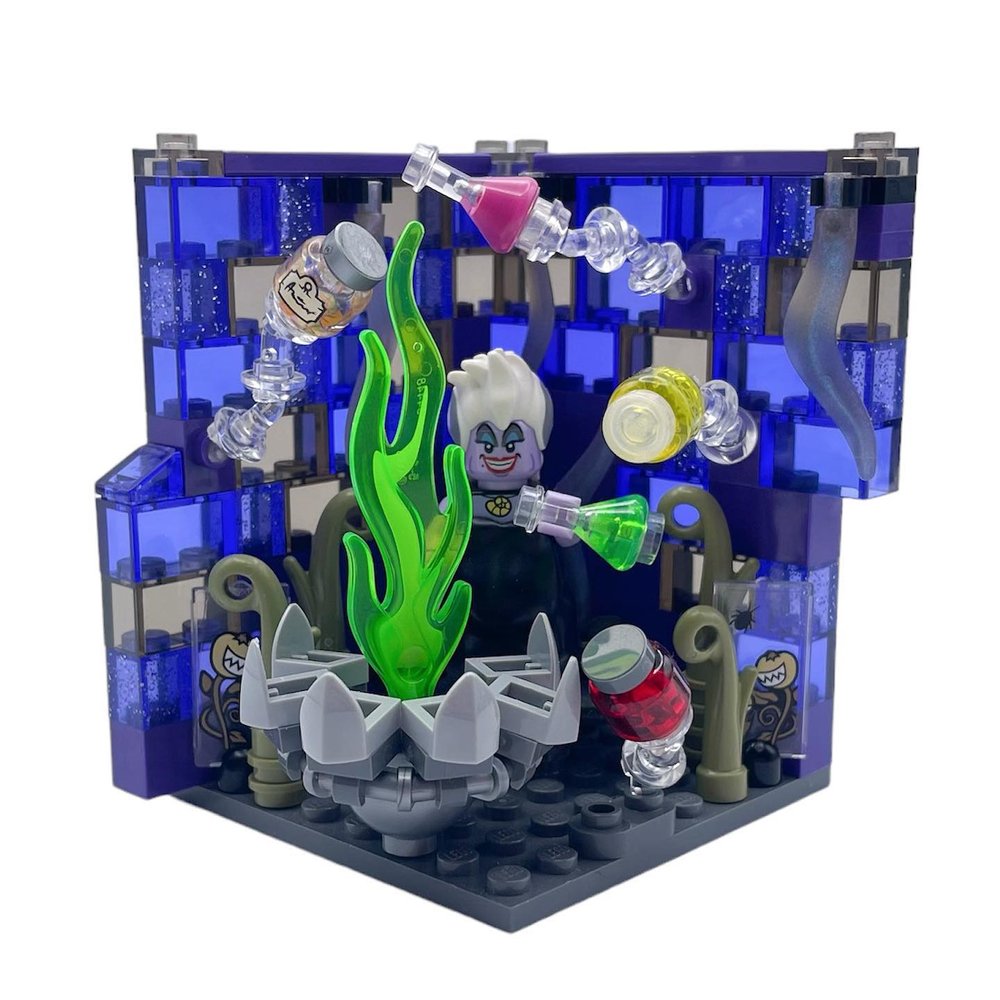
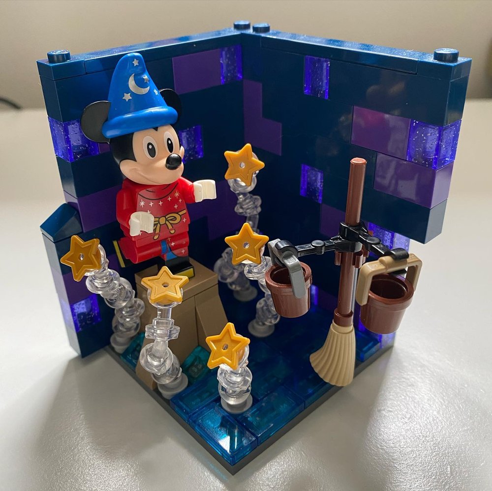
Have the character facing away from the viewer instead of being placed in the center looking straight out towards you. Try adding the impression of movement. You can use clear minifigure posing pieces that came out in recent years to position elements and give the illusion of movement.
Such as this Ursula habitat by Jen or the Fantasia Mickey habitat by Lisa Fasciglione.
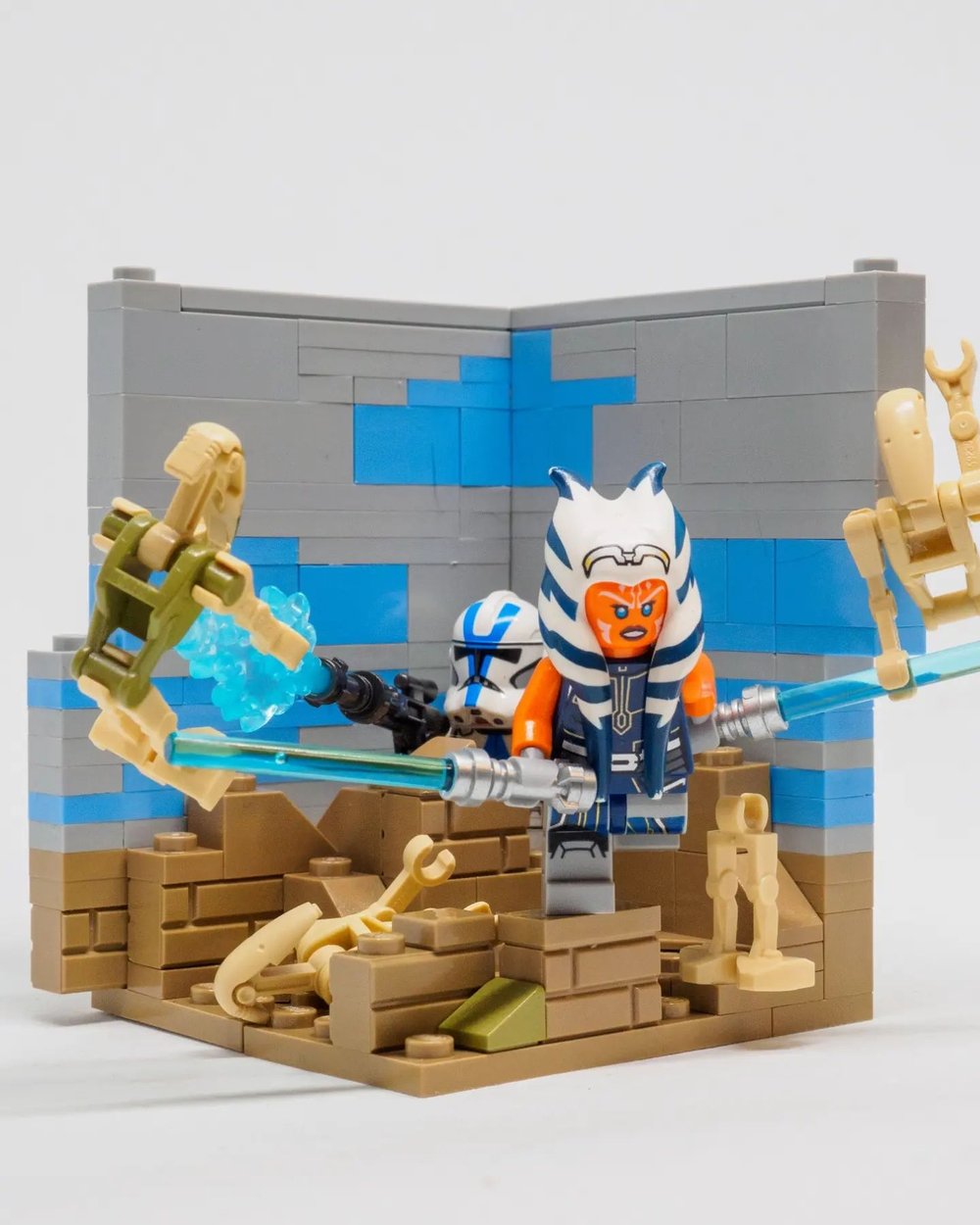
Yabs Lee (brickapal00za) does a masterful job of this in this four-figure battle scene all packed into a single habitat. There’s also a clean and clear composition using several of the skills we’ve gone over in this article, including simplicity in the sky contrasted with clumped detail in the lower portion, a clear color palette, and contrast that makes the bright white of Ahsoka and the trooper stand out against the darker tones in the rest of the habitat around them.
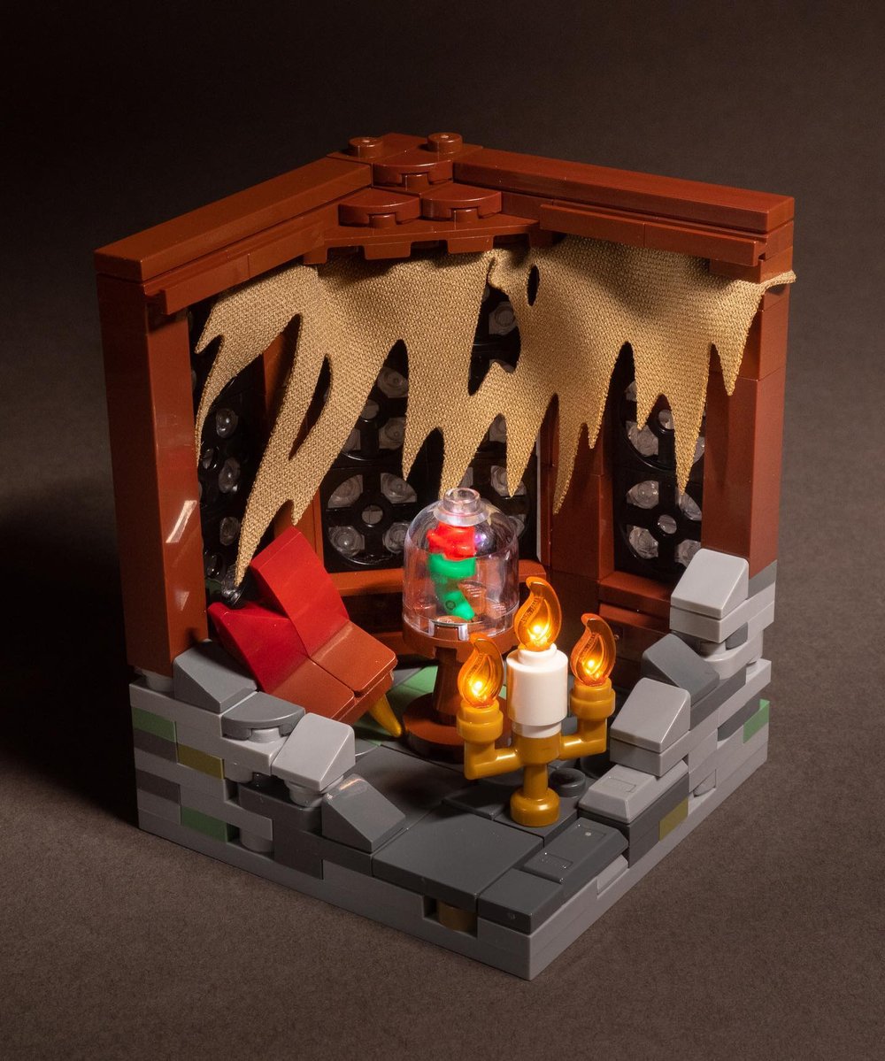
You can also go with a cinematic treatment and lighting to capture the mood and heighten the drama to bring out the emotion of the story. I’ve always loved how much light adds to any build. And it’s no different in habitats. A well-chosen light or dramatic photo lighting can both add to the final impact. Lumière with the rose from Beauty of the Beast is one of my favorite habitats because of the emotion and drama evoked within it, even without seeing the character’s face.
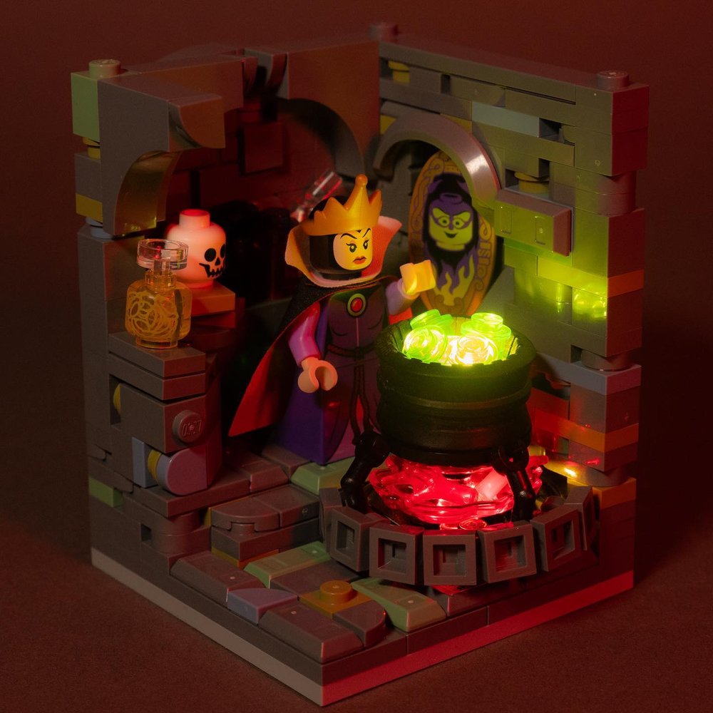
Lighting built into the habitat itself can cast dramatic shadows, highlights, and color casts, like my Evil Queen cooking up her curse for Snow White.
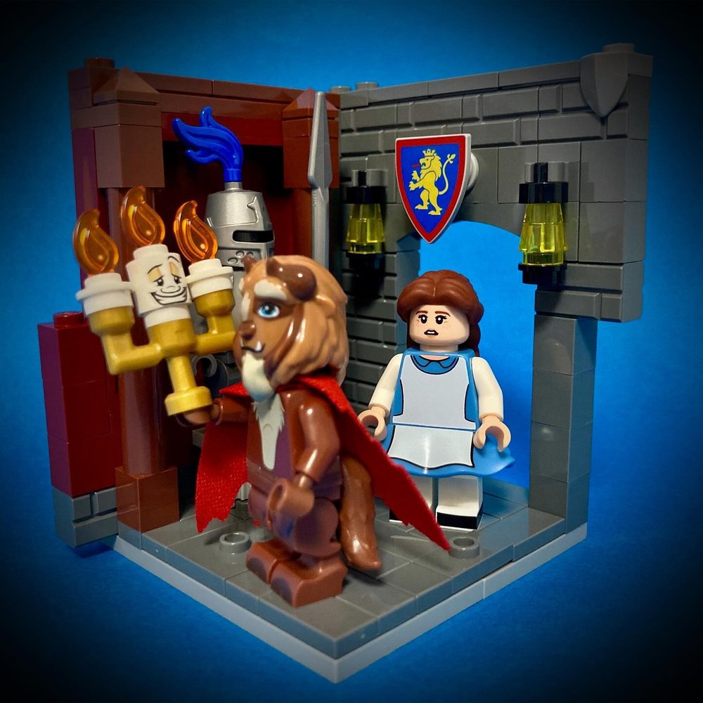
You can have multiple characters that are interacting with each other. Such as the Ahsoka battle scene above, the Muppets Frankenstein habitat, or this scene from Beauty and the Beast by lego_nano_1, including the emotion on Belle’s face as she’s introduced to the castle she will now be a prisoner in.
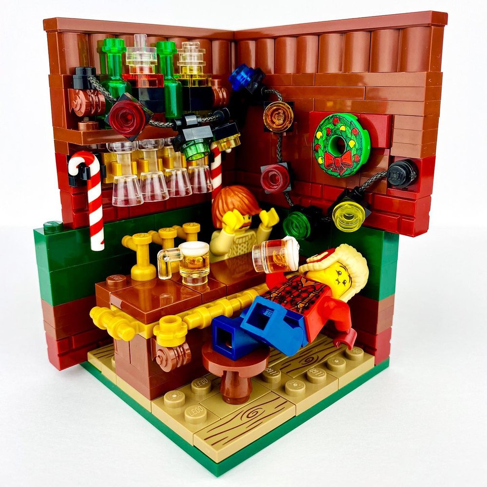
And there is always comedy. Go for the funny bone with a humorous scene that pokes a little fun. Such as this build from the holiday habitat challenge by Taylor (bricksandchaos) of a guy having a little too much Christmas cheer. You can never go wrong with a little humor!
There are so many ways to tell some story in your habitat haiku, despite it’s small size. Even the items you put in their environment can subtly tell a story about the character. It doesn’t have to be an epic story. Just a little something that adds a richness and context to the habitat scene.
Bringing it All Together
How you bring these core skills together is where they shine. Adding any one of these elements into your build will elevate it. An amazing story can elevate an average build. A striking clear color palette can improve the most simplistic or messiest of habitats. But when you start combining these elements so they work together, you start to build something exceptional. Clear, rich, detailed, focused, and beautiful.
Truth is, these same skills can be applied to any build, any design, and any work of art. And you’ll be happy you did. Jen always seems to have a habitat challenge going on at @habitatchallenge where you can get all the details, including the fourth annual Disney habitats challenge happening May 9th-11th, with final stacks on the 12th. Happy habitation!
Think you might try building a habitat? Or are you al ready an old pro? Let us know in the comments below!
Do you want to help BrickNerd continue publishing articles like this one? Become a top patron like Charlie Stephens, Marc & Liz Puleo, Paige Mueller, Rob Klingberg from Brickstuff, John & Joshua Hanlon from Beyond the Brick, Megan Lum, Andy Price, Lukas Kurth from StoneWars, Wayne Tyler, Monica Innis, Dan Church, and Roxanne Baxter to show your support, get early access, exclusive swag and more.

